UI design proposals
Learning-experience artifacts
High-fidelity prototypes
Interaction-pattern library
Experience
Learn through patient situations
Students move from clinical content to application and feedback without leaving the lesson.
Experience
Students move from clinical content to application and feedback without leaving the lesson.
My contribution
I defined the lesson structure and core case-study interaction, then co-built the pattern library with two UX designers.
Delivery scale
One shared system used by more than 120 authors and subject-matter experts.
Pearson’s nursing eTexts were organized like books: students read in one place, practiced in another, and completed assessments somewhere else. Pearson Interactive Nursing (PIN) brought those tasks into a single lesson built around patient situations. The goal was to help students find what they needed quickly, then apply it in context.
The pattern library supported 161 modules across six nursing courses and gave more than 120 authors and subject-matter experts a shared way to build.
Pearson surveyed 981 nursing students across 31 courses and interviewed 12 instructors. I analyzed the findings and wrote the supplementary research report that guided the design team.
Five findings shaped the product direction. Each one led to a specific design implication.
10 of 12
instructors preferred to assign homework digitally
11 of 12
instructors emphasized a patient-centered approach to teaching
Three decisions organized the work: center each lesson on a patient situation, keep instruction, practice, and feedback in one flow, and give authors reusable patterns instead of page-by-page layouts. Over three months, experience mapping, concept testing, and co-creation sessions turned those decisions into the lesson model and interaction library used across the program.
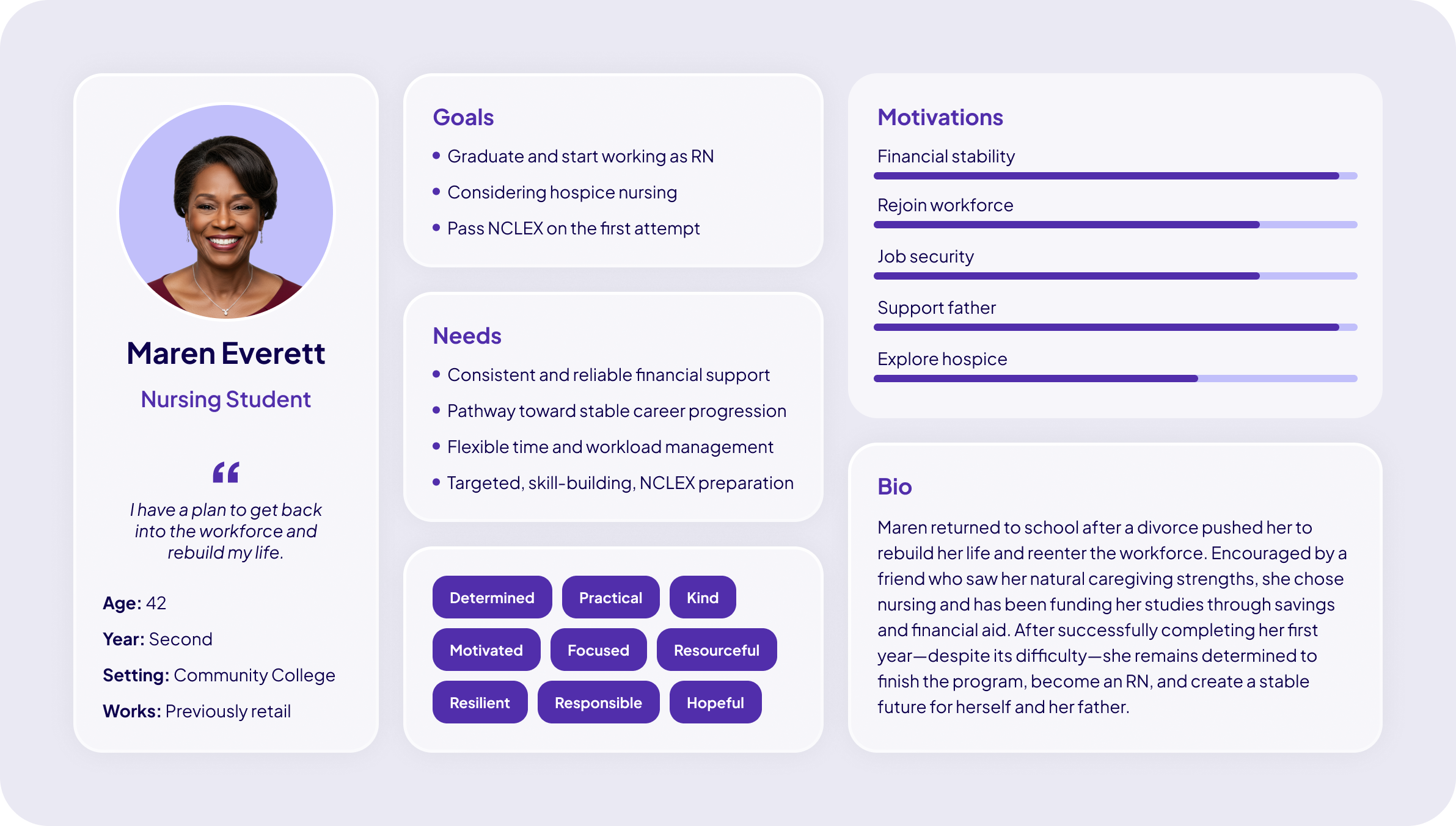
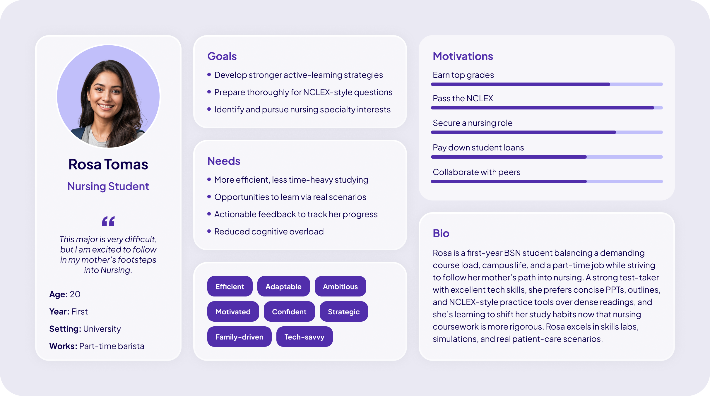
These two research-based archetypes captured a shared constraint: learners studied in short sessions between clinical hours, family obligations, and work. That pushed us toward resumable progress, focused screens, and feedback that stayed inside the lesson.
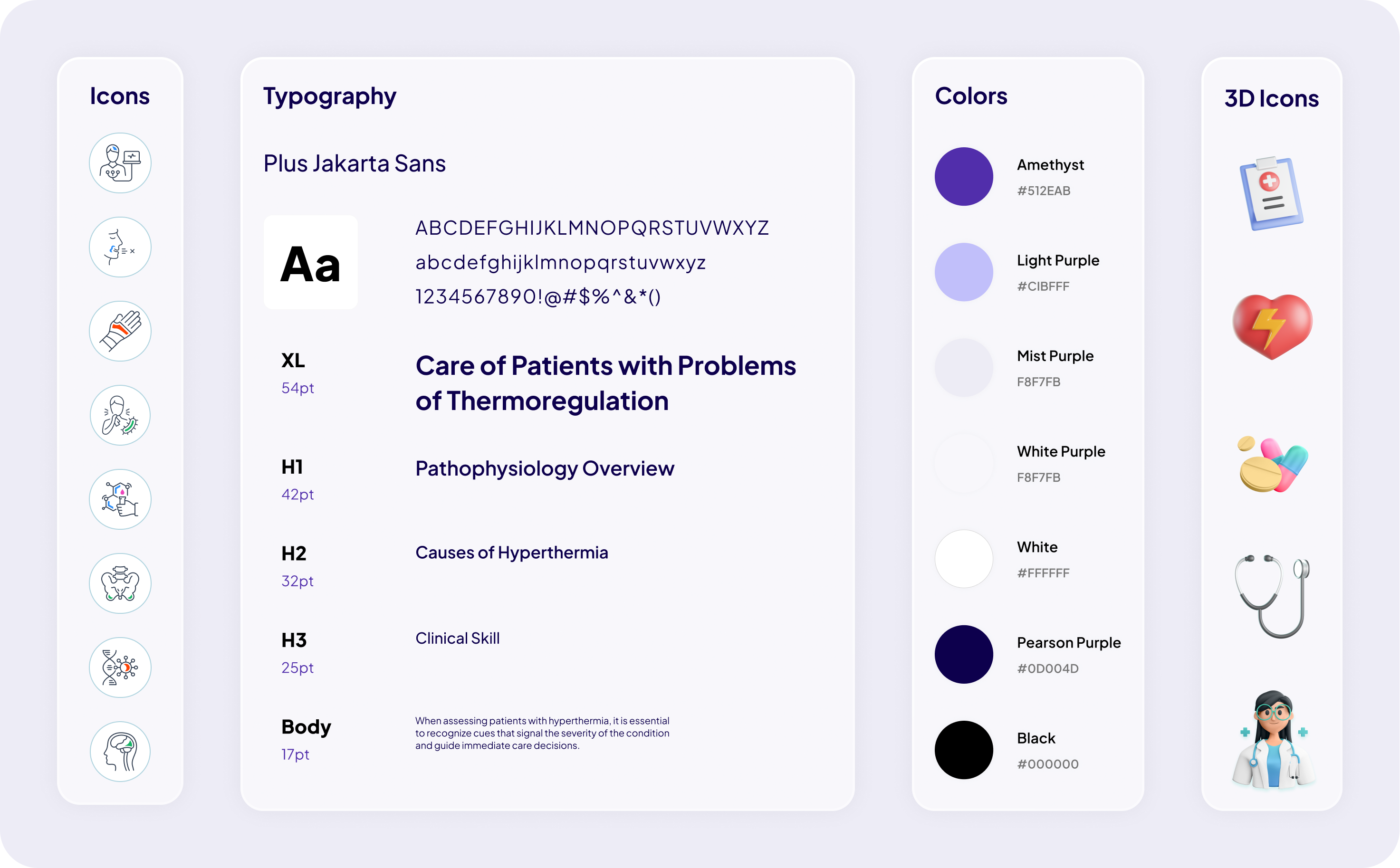
Three UX designers, including me, built the design system. With 673 lessons across six courses, a pattern had to exist for the edge cases as well as the common ones, or authors would invent their own. The counts below are what shipped in the library.
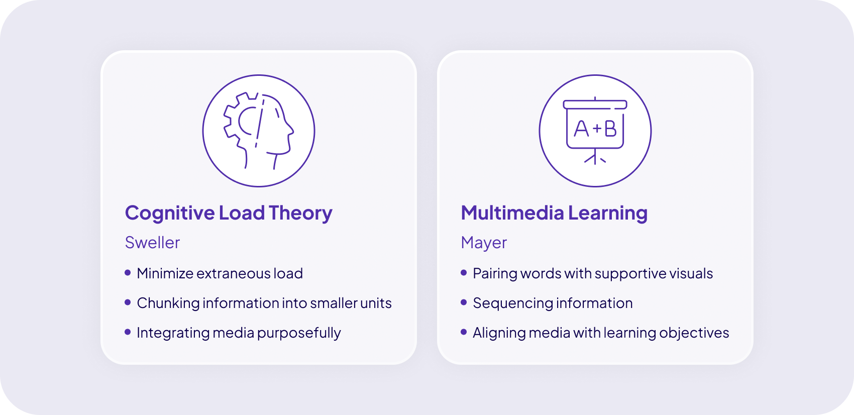
Two rules guided every interaction: keep each screen focused on one manageable task, and pair unfamiliar clinical concepts with a useful visual. Other learning theories shaped individual components, but these rules kept the pattern library consistent.
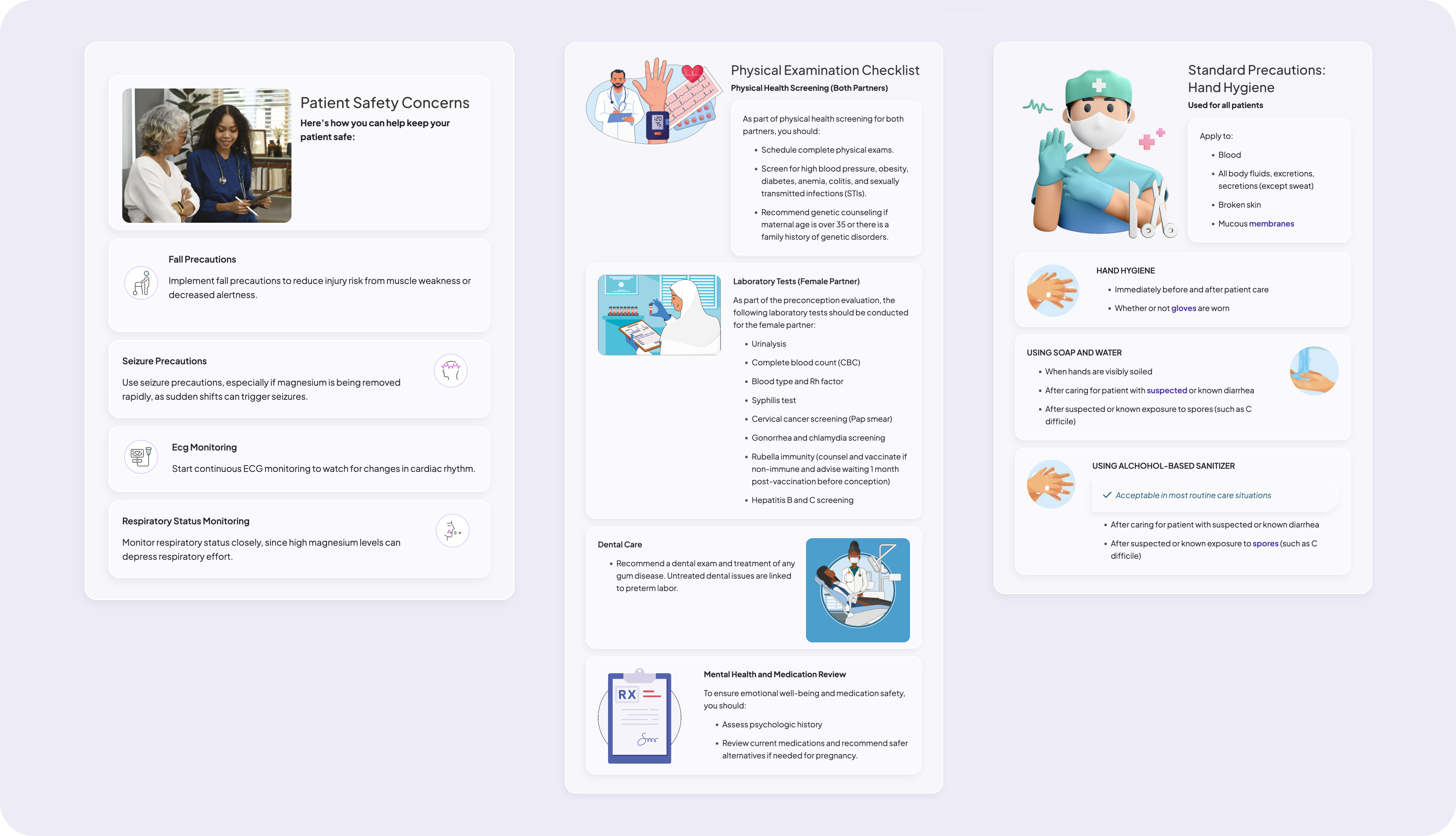
PIN infographics cut the traditional poster-style infographic down to one idea per tile, sized to sit inside a lesson rather than replace one. Each tile carries a title, an image, and a short explanation, so related elements sit together and a set of ideas reads as comparable units instead of a block of prose. Pairing short text with a supporting visual keeps the learner's effort on the concept rather than on the layout.
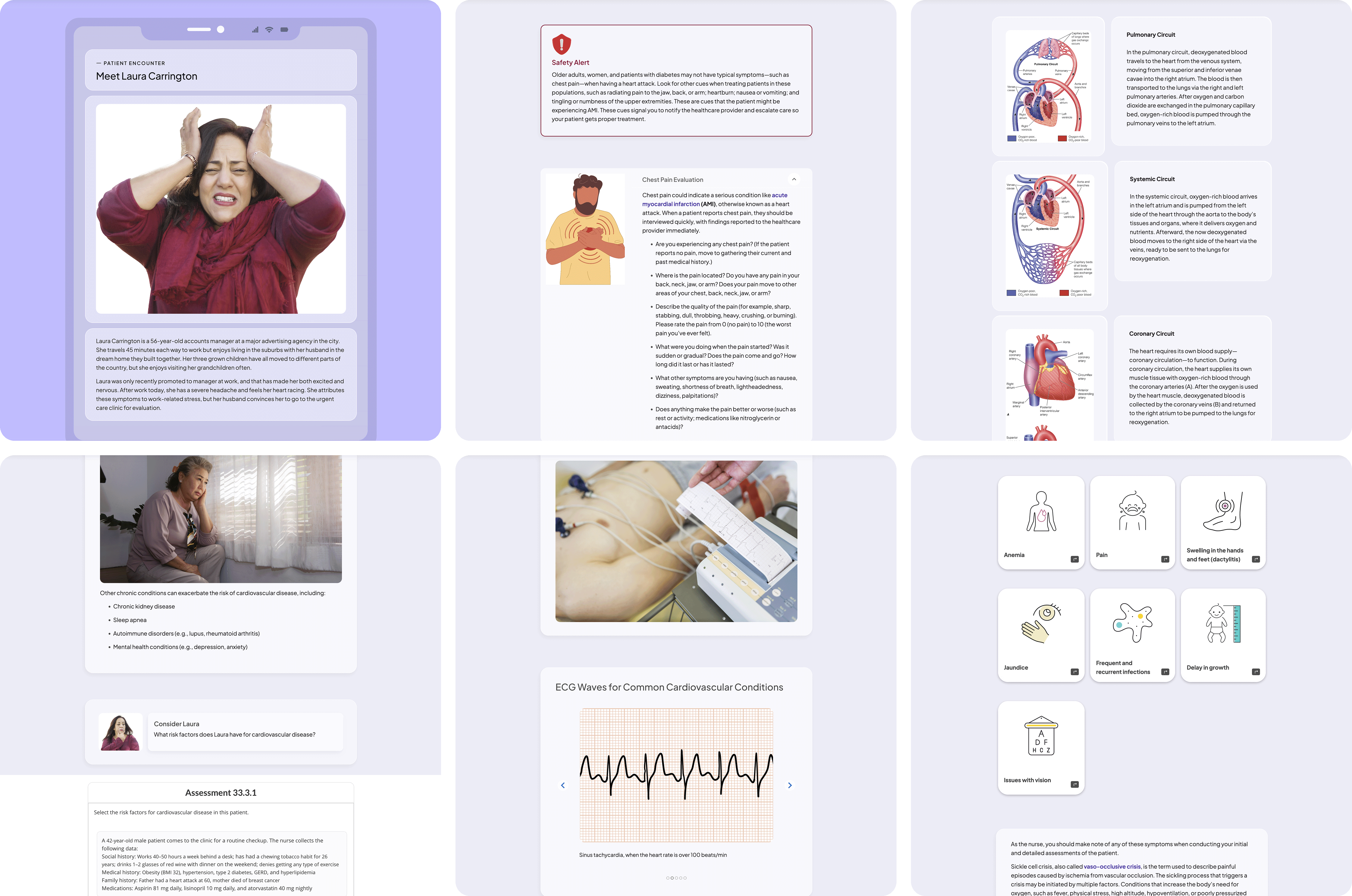
Research put nursing case studies at the center of the experience, so I spent the most design time on Patient Encounters: the component that carries a case and keeps the learner working through it. Patient Encounters break a case into patient-relevant screens and convert dense clinical detail into interactive formats. Low-stakes questions attached to each screen require the learner to apply what they just read, and return feedback in place.
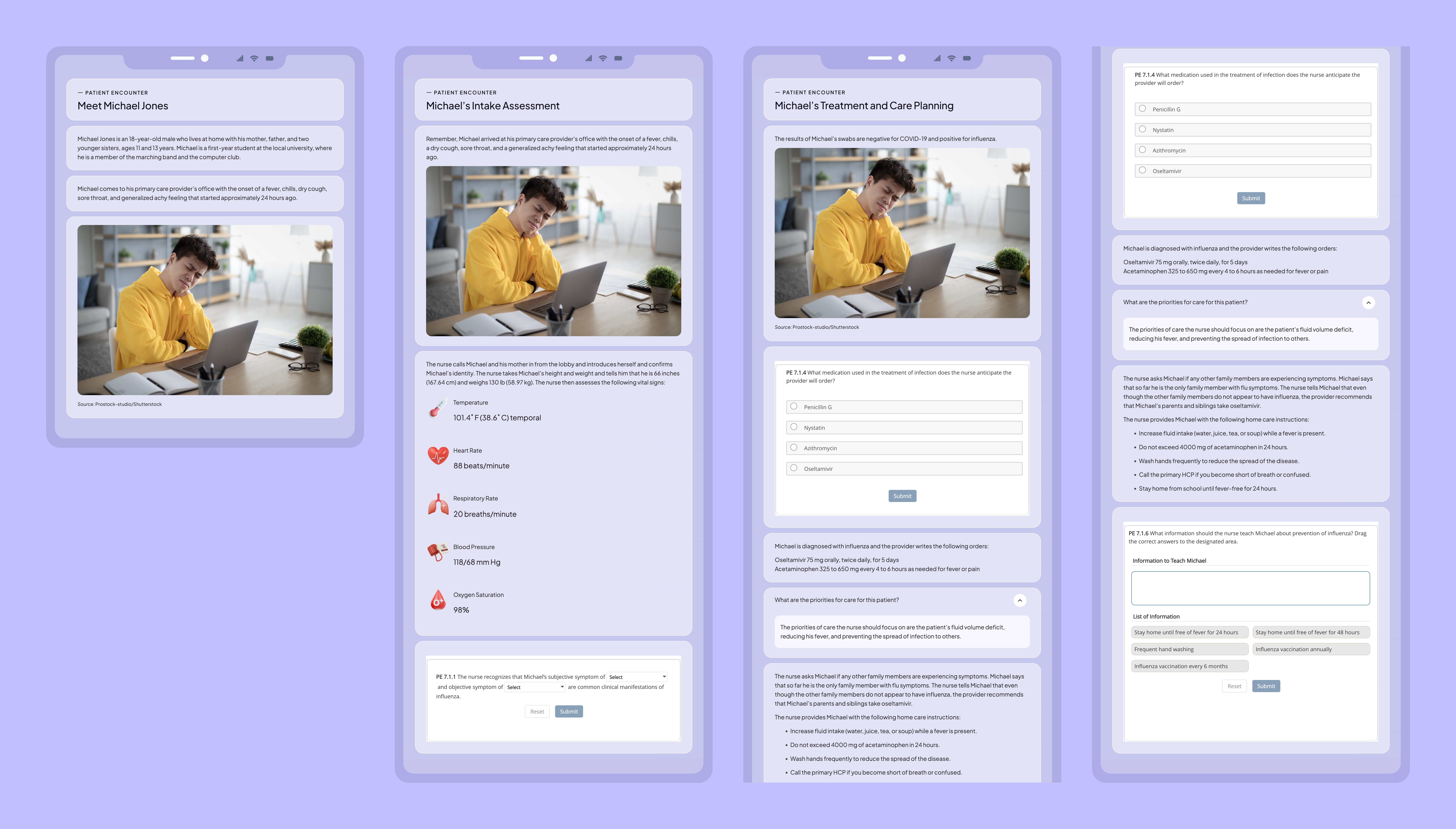
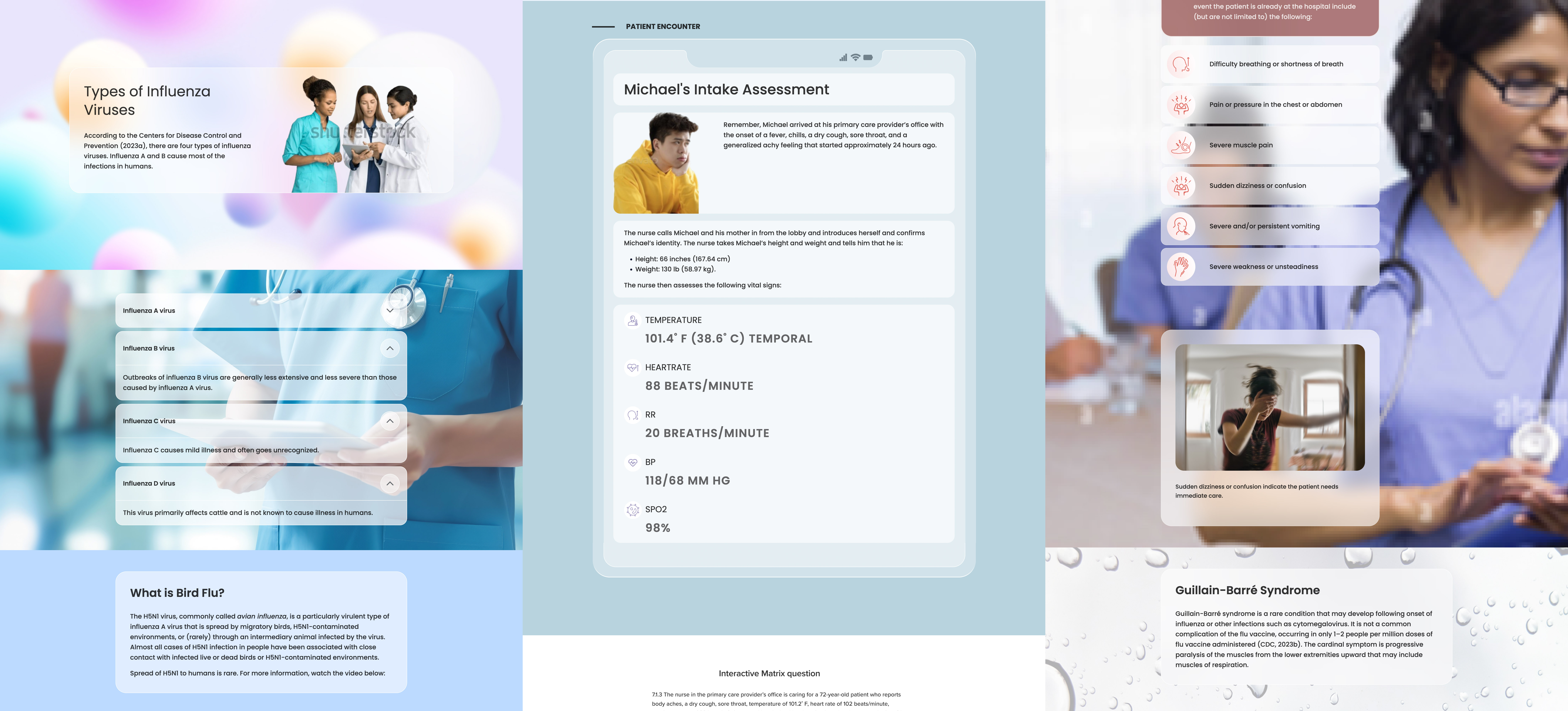
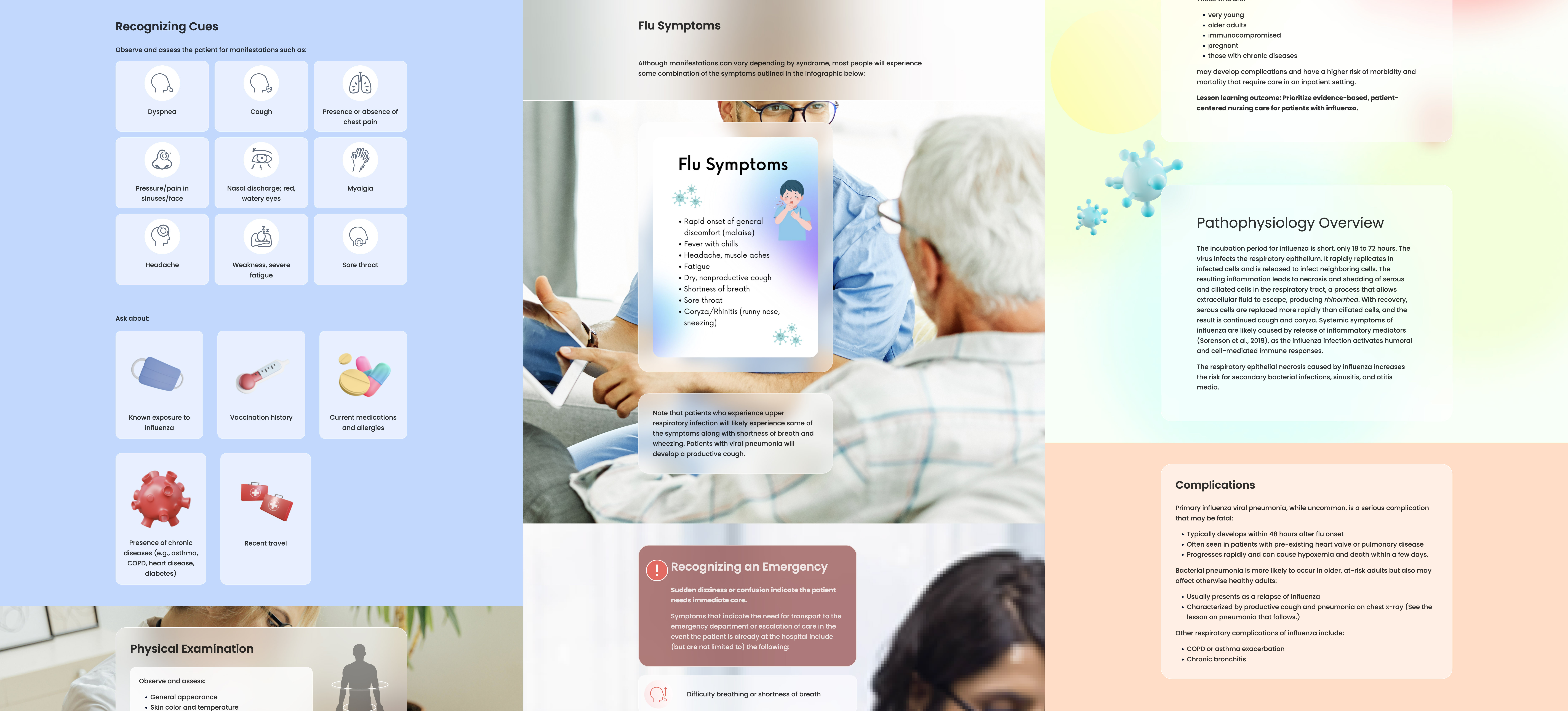
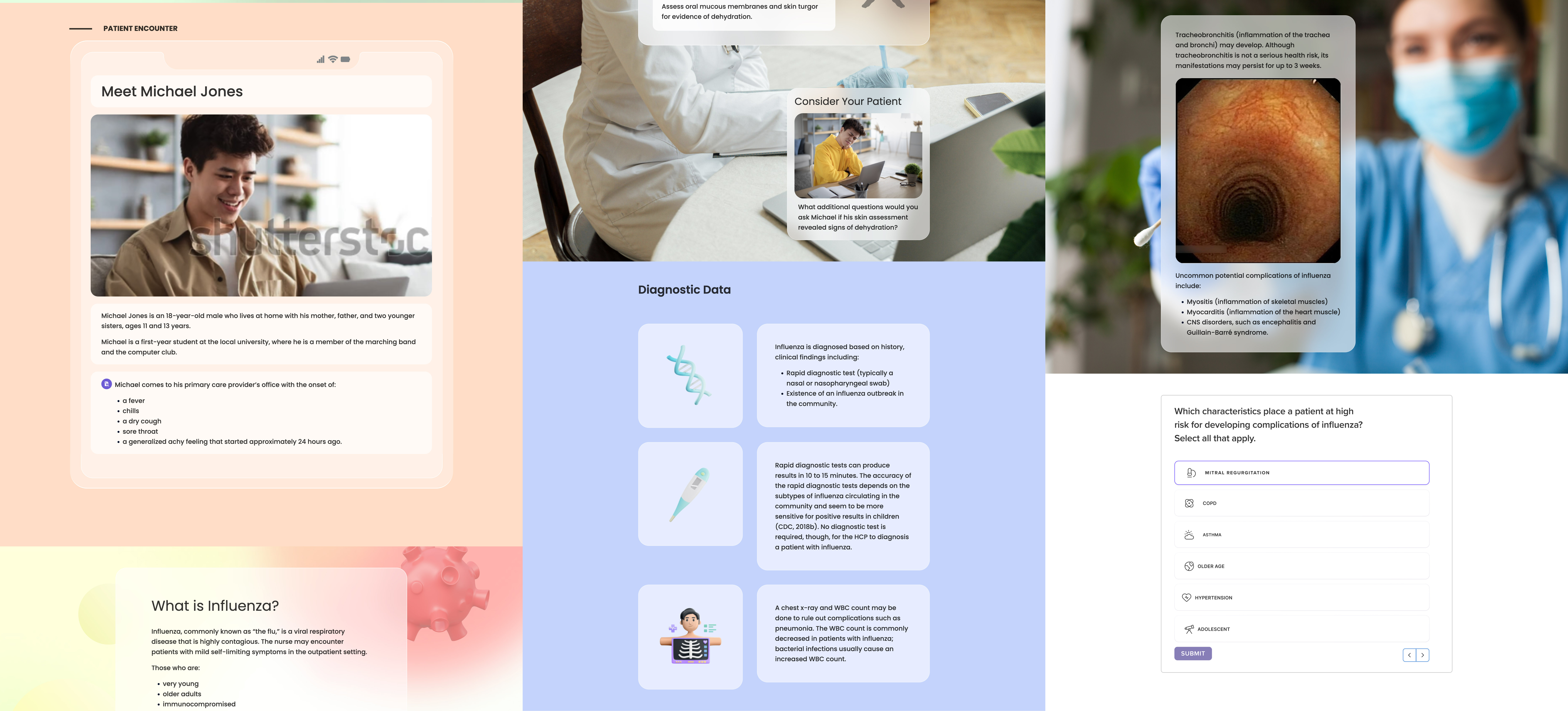
Three screens from the first high-fidelity reference lesson.
Testing with 15 nursing students and five instructors supported the core concept, but exposed two practical problems: slow loading and controls that were difficult to find.
Loading performance
13 of 15
Slow screens interrupted the lesson and made the prototype feel harder to use.
Recommended response
Measure page weight and load time with engineering, compress or lazy-load nonessential media, and provide clear loading feedback.
Navigation discoverability
10 of 15
Unclear controls contributed to incomplete lessons.
Recommended response
Keep Next and Back controls persistent, pair icons with text labels, and show skipped questions before submission.
Case studies
5 of 5
Faculty confirmed that the case-study design emphasized patient-centered learning.
Recommended response
Keep Patient Encounters as the core case-study pattern.
Design experience
14 of 15
Students preferred the new presentation to the eText and print textbooks they had used previously.
Recommended response
Keep the core experience digital while preserving options for printable summaries, offline access, and flexible note-taking.
Image presentation
11 of 15
Students said the images and interactions helped with recognition and memorization.
Recommended response
Prioritize visuals that explain a concept; remove images that only decorate the page.
Every lesson across six nursing courses was produced from the shared pattern library, giving students a consistent interface and authors a constrained way to build. The completed system was validated in a Spring 2026 classroom pilot.
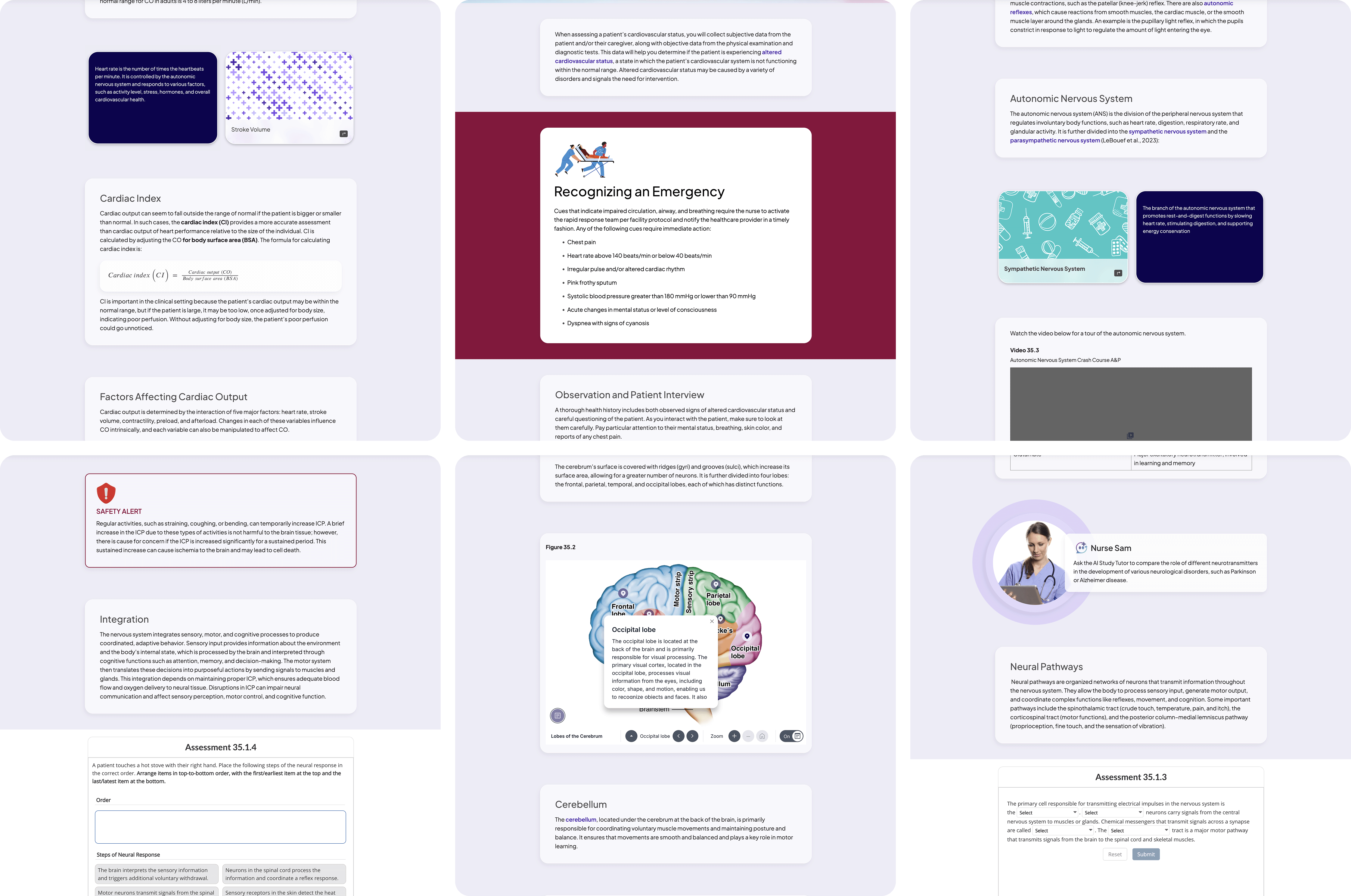
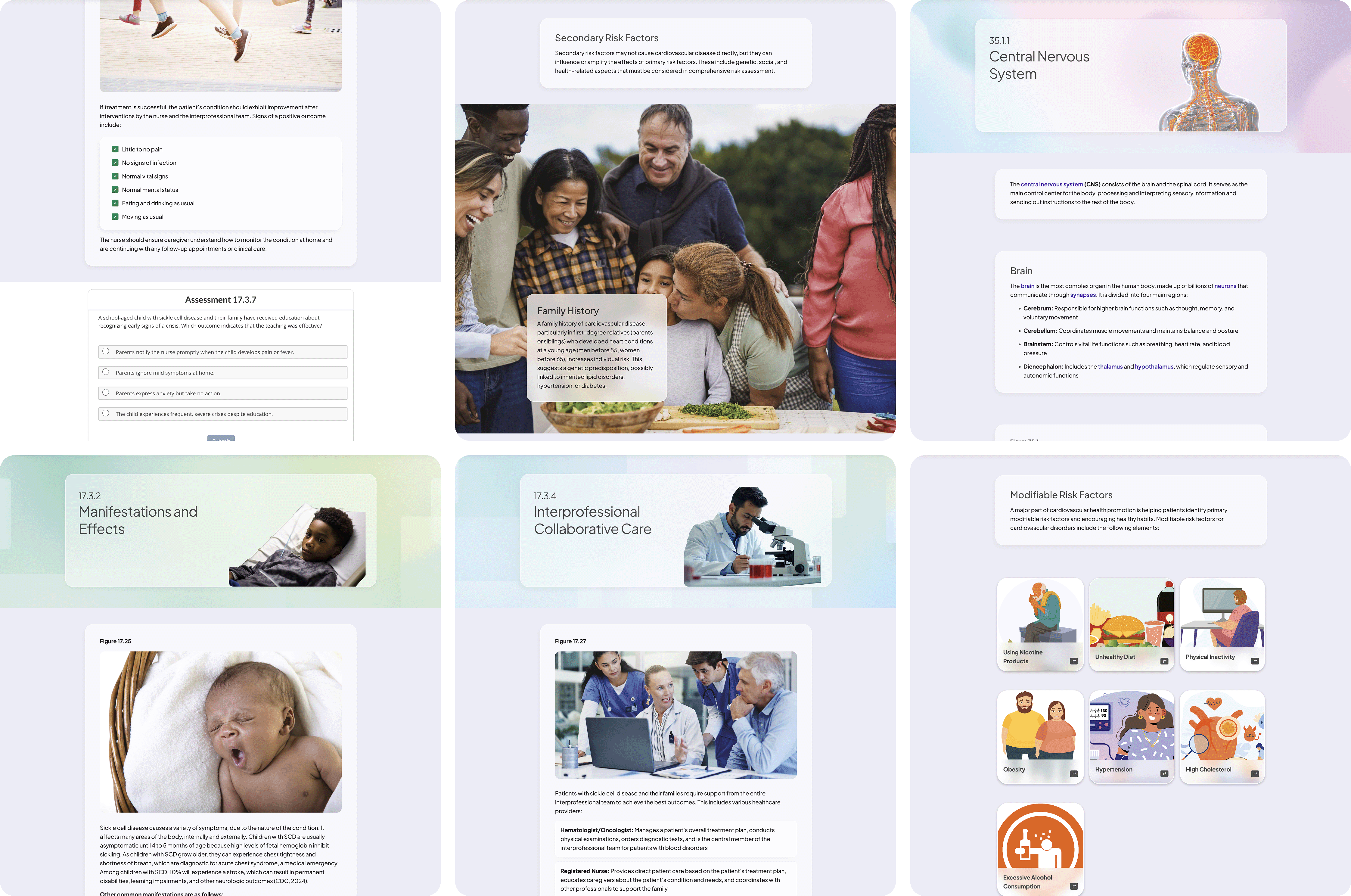
Spring 2026 pilot: 45 students and 12 instructors. Valid response counts varied by question and are shown with each result. Unless noted, findings reflect self-reported perceptions rather than observed behavior.
Content clarity
95.3%
The lesson structure and segmentation were working.
Patient context
93%
The central patient-first design decision held up in the classroom.
Engagement
93%
Self-reported agreement; attention was not tracked behaviorally.
Four additional findings from the same pilot add context to the primary results.
Media balance
90.7%
Perceived retention
90.9%
Ease of use
82.5%
Instructor view
90%
Strong feedback did not eliminate every obstacle to completing a lesson. Two issues should shape the next design cycle.
Completion navigation
Students struggled to locate unanswered questions before submitting a lesson.
Next step
Mark skipped questions in the lesson navigation and provide a review screen before submission.
Digital-only learning
Although most participants preferred the digital experience, 12 of 44 students (27.3%) were uncomfortable replacing print materials completely.
Next step
Keep the core experience digital while testing printable summaries, offline access, and flexible note-taking.
The 16-month program led to a design leadership role for me at Pearson. Looking back, I would change two things.
Documentation did not move manuscript quality. A working lesson did. On the next program I would build the reference lesson before writing the pattern documentation and treat the prototype as an authoring tool from the first week.
673 lessons stayed coherent because authors had fewer choices. The patterns that held were the ones that made the wrong layout difficult to build. The patterns that relied on authors reading guidance drifted.
