Background
Half of patients had stopped reporting by the end of treatment.
Tuberculosis treatment runs six months, most of it managed at home between clinic visits. TB Companion was tested in a 555-patient randomized trial in Argentina, with 277 patients in the app arm. The outcomes were strong enough to publish. The design implications underneath the records had never been translated into artifacts.
That record is what this redesign is built on: engagement falling through the continuation phase, the messages treatment supporters spent their time on, and what patients said in exit interviews. The redesign has been evaluated by clinicians and has not yet been tested with patients.
Deliverables
Personas, journey map, UI design system, high-fidelity prototype, functional coded prototype
Role
Sole UX practitioner: research, product design, prototyping, and evaluation
How might we provide safe, empathetic support between clinic visits while keeping clinical judgment with the care team?
Research
The trial measured whether it worked. Nothing in it explained why patients stopped.
The trial answered whether the intervention worked. It did not answer why, or for whom, or what to build next. So we went back into the data it had generated: every message patients and treatment supporters exchanged, every day of app use across the full treatment course, and the exit interviews.
277
Patients using the application
38
Exit interviews (33 patients, 5 providers)
Key findings
We ran five analyses across these datasets, each with its own method and its own team of coders and statisticians. What follows is a fraction of that work; the full set was published as eight peer-reviewed papers.
59.7%
of 6,805 messages were report reminders
Call For
Adaptive auto-reminders
AI Opportunity
AI sends personalized medication reminders
10.4%
of 1,235 symptom and support reports required additional help (128)
Call For
Guided side-effect triage
AI Opportunity
Acknowledge and clarify the concern immediately, then route clinically sensitive cases to the care team
35%
average test strip submission rate
Call For
Explain-first test process
AI Opportunity
AI reads the test and explains the result
50%
of patients still reporting by the end of treatment
Call For
Reduced reporting burden
AI Opportunity
AI turns the daily report into one check-in
12 days
longest wait for a reply to an urgent patient request
Call For
Unanswered-message escalation
AI Opportunity
AI answers routine messages, escalates the rest
Ideation
Every persona attribute traces back to a figure the trial recorded.
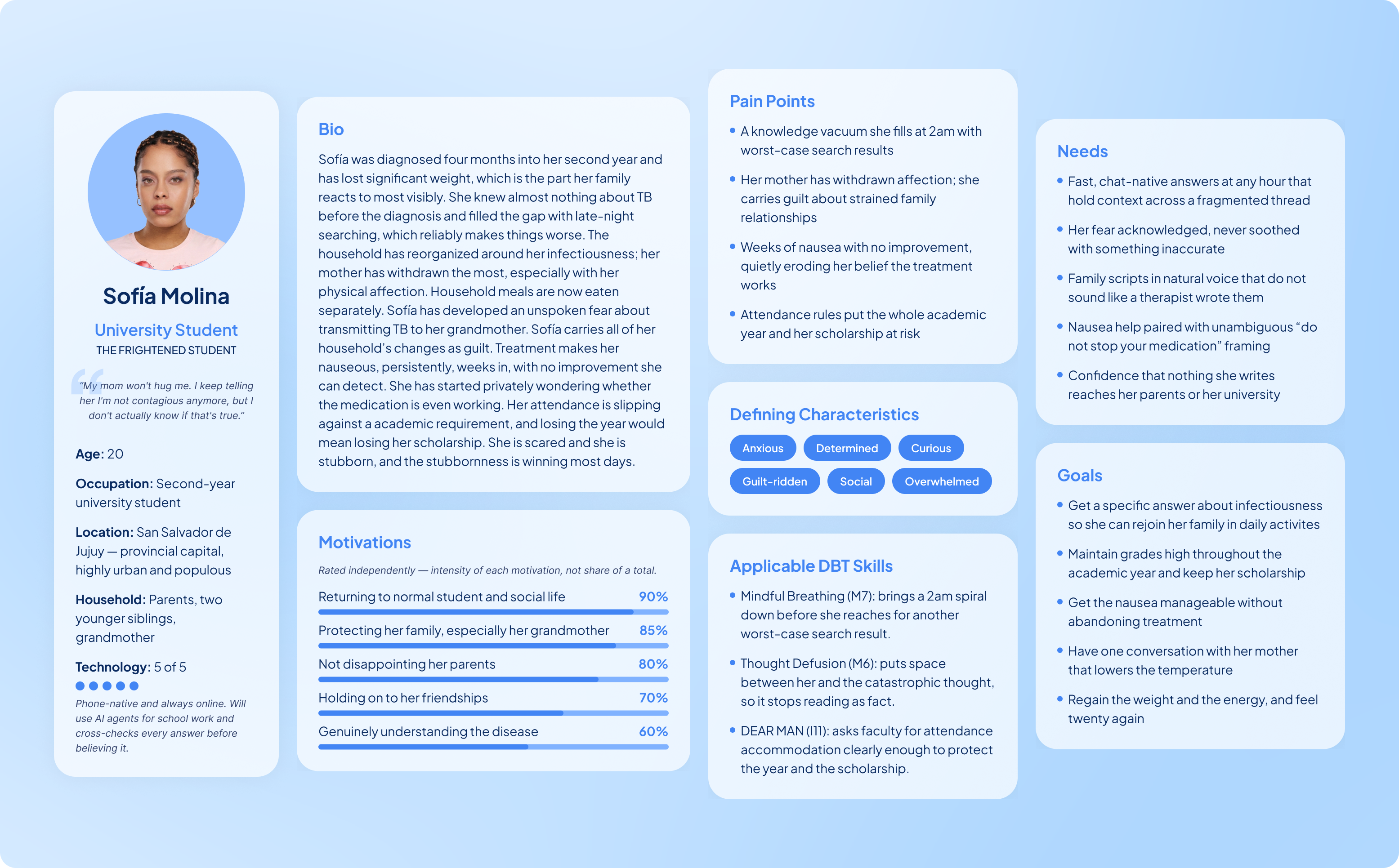
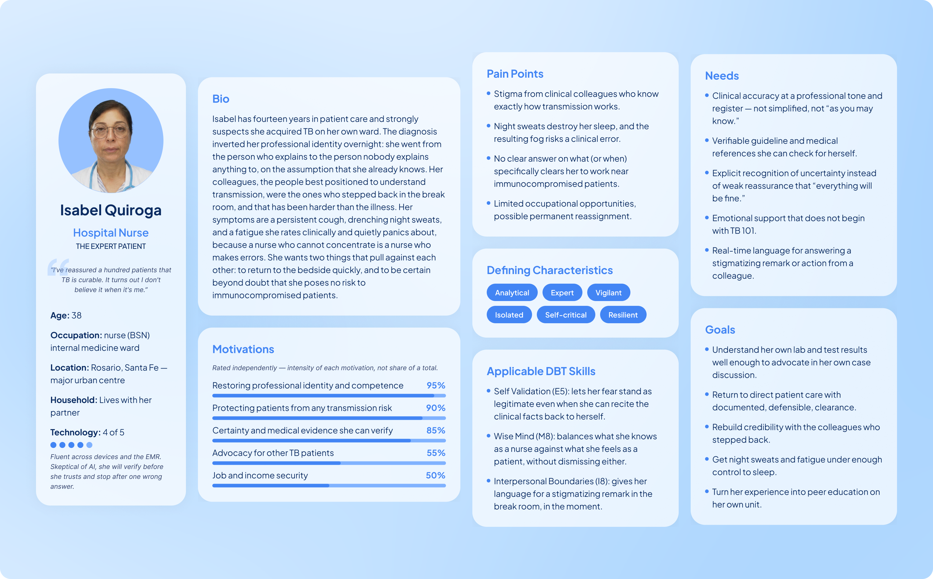
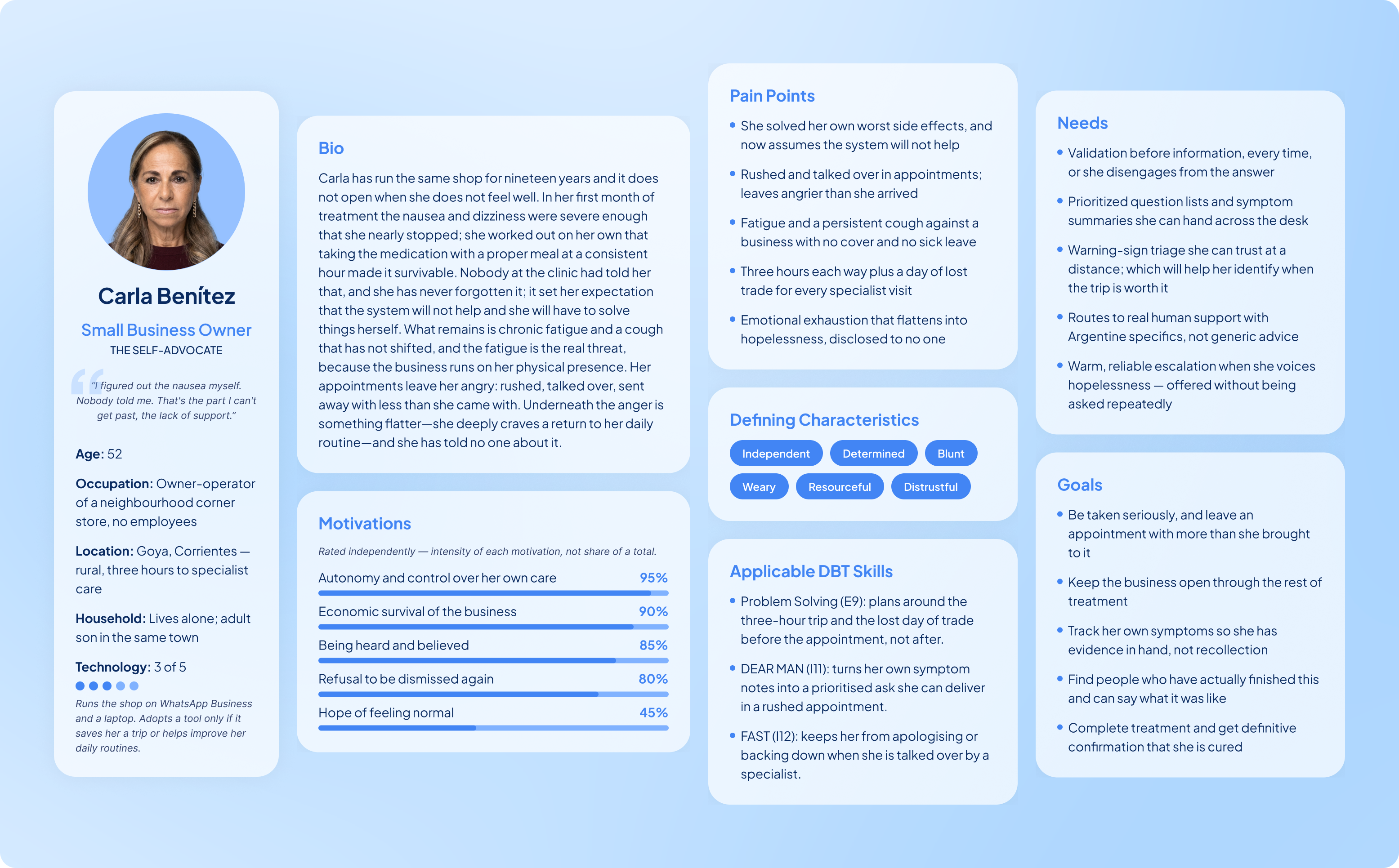
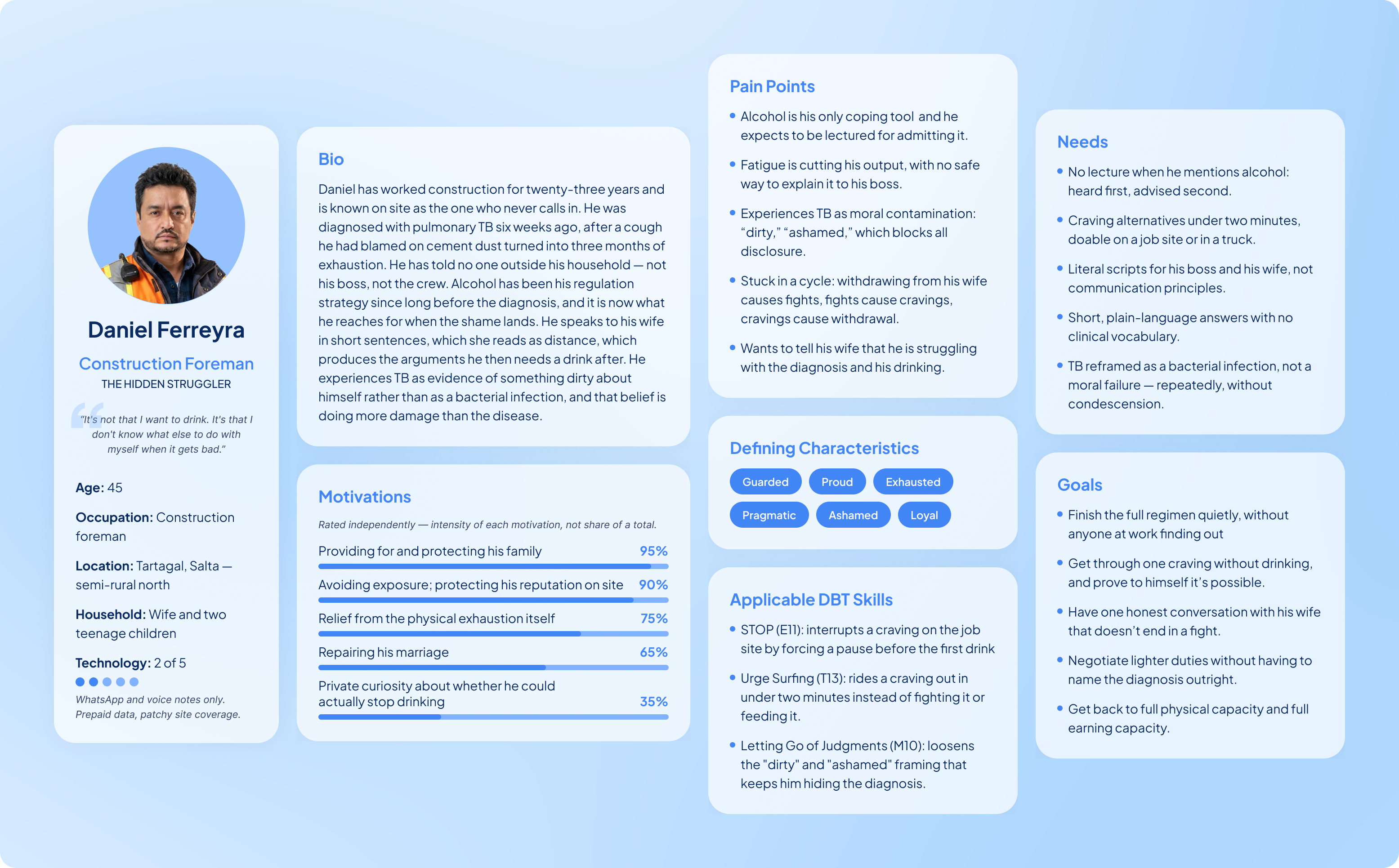
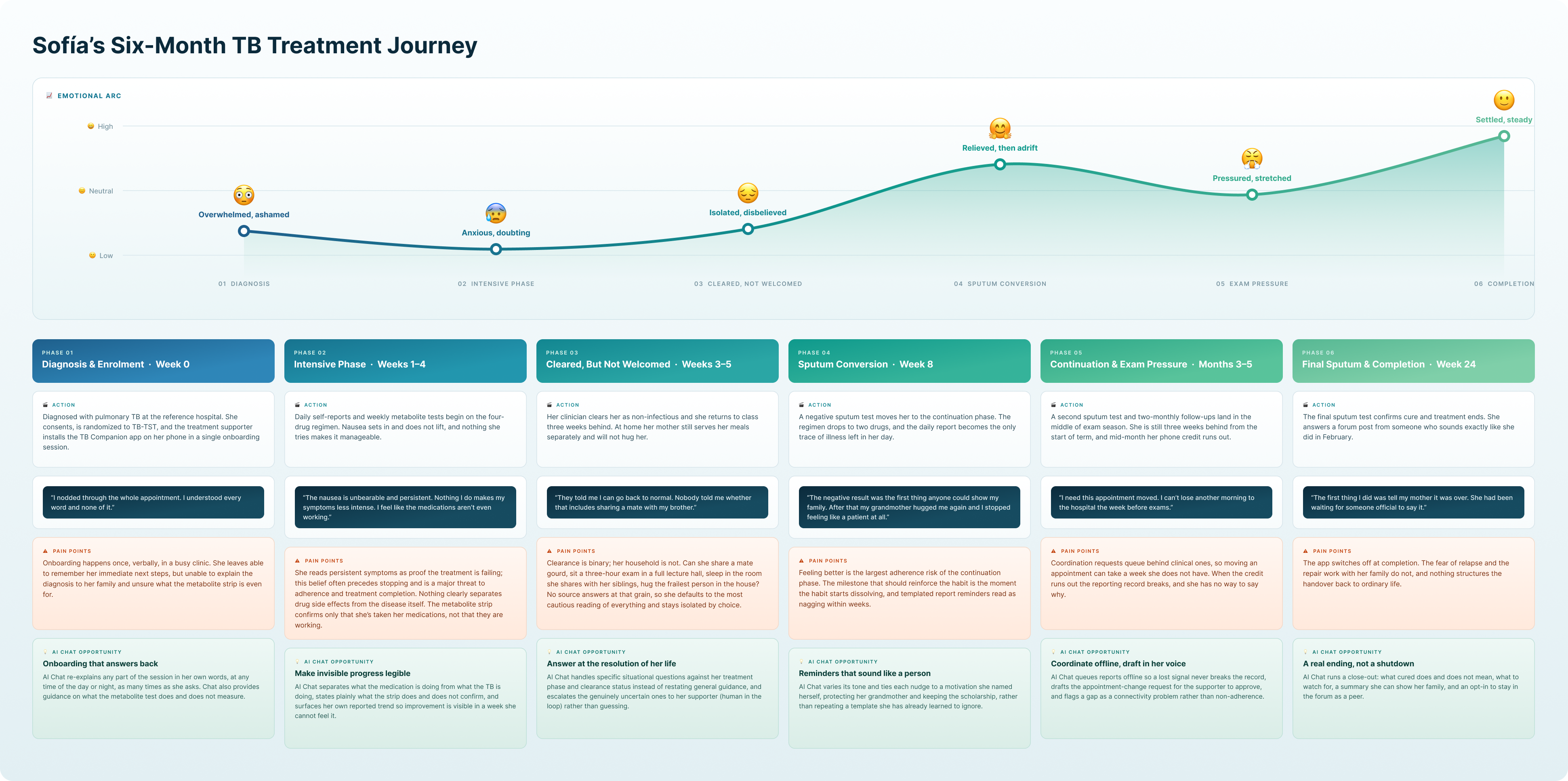
I turned five analyses into artifacts the team could design against: four personas and a six-month journey map. Patients appear in them as people managing treatment inside families, jobs, schools, stigma, patchy connectivity, and uneven access to care.
Personas
Every attribute traces to a trial figure, an interview theme, or a coded message. Age bands follow the trial's distribution, income and employment follow the recorded proportions, and side effects follow what patients logged. Quotes come from exit interviews and the message log. Each persona combines a contextual biography with motivations, pain points, defining characteristics, applicable DBT skills, needs, and goals.
The personas established the design objectives for the AI agent: validate before advising, use plain language without being reductive, protect privacy, provide trustworthy triage, and escalate to a human when the situation exceeds the system's confidence. Each card carries an Applicable DBT Skills tile naming the techniques the agent should reach for with that persona.
User journey map
The map follows Sofía across the WHO-standard six-month course, plotted against clinical milestones, with the app's engagement curve laid over it: 78% of participants still reporting at 60 days, 50% at 180. The drop lands in the continuation phase, where the drug count halves, symptoms lift, and the daily report becomes the only remaining trace of illness in the day. Pain points at each phase come from interview themes and message content, and each phase closes with a named AI chat opportunity.
Design system
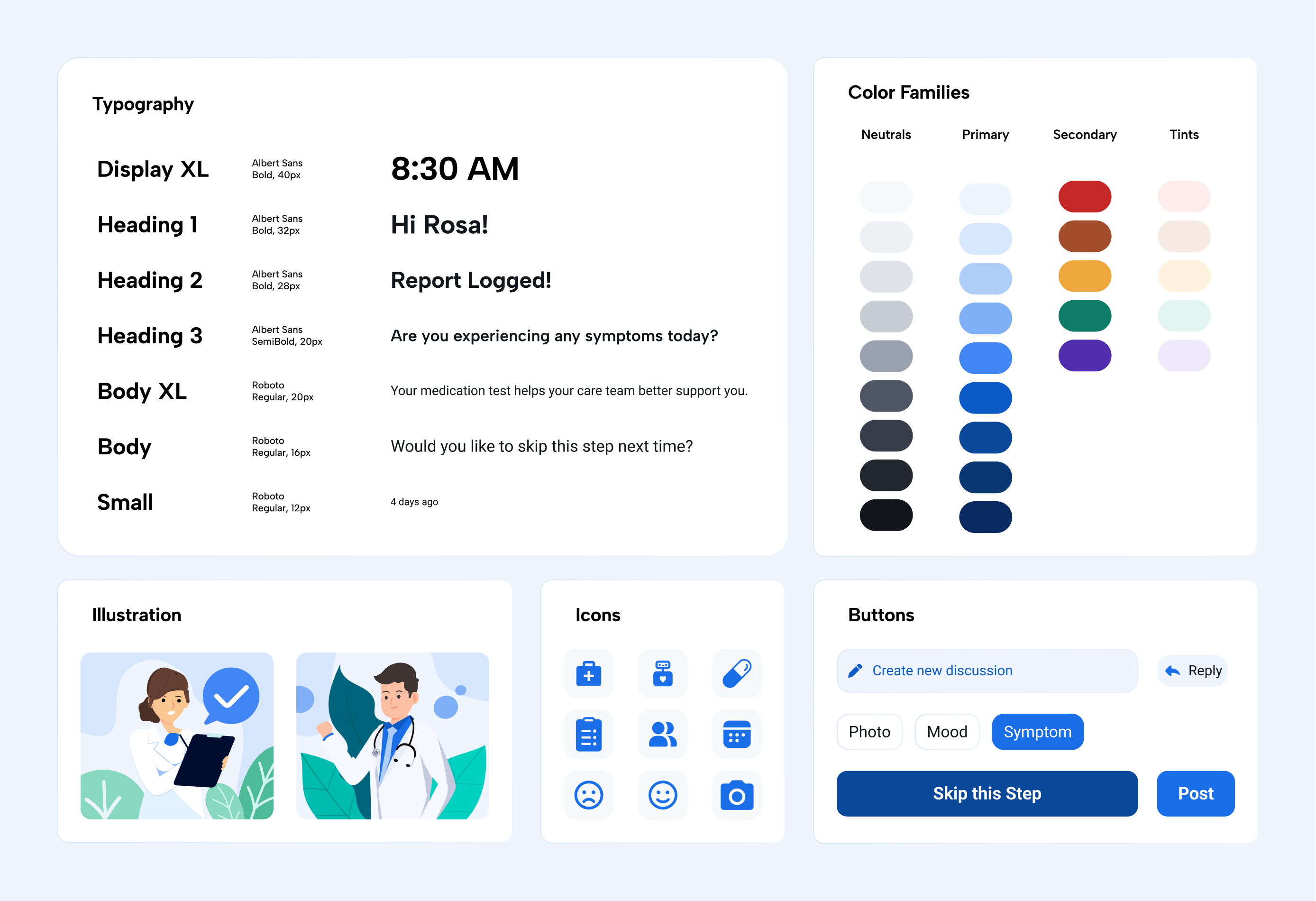
The original app's system had one accent color, two type sizes and no spacing scale, so every new screen meant a new decision. I rebuilt it as three color groups—primary for active and decorative UI, neutrals for structure, secondary and tints for state—on a base-4 spacing scale, with Albert Sans for headings and Roboto for body. The AI chat surfaces needed states the old system had no vocabulary for: agent versus human, pending versus escalated, confident versus deferred. Those came out of this work.
AI Integration
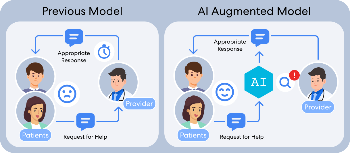
The agent answers first, and anything clinical routes to the care team before it reaches the patient.
The messaging analysis made the strongest case: treatment supporters sent 6,805 messages to 277 patients over the trial; 59.7% were reminders to submit a report or check in, while 38.0% of patient messages asked about symptoms or side effects. Both needs were bounded and repeatable enough for an agent to assist with. The agent could provide immediate answers and reminders, while treatment supporters remained responsible for emotional support, care coordination, urgent symptoms, and clinical judgment.
Human in the loop
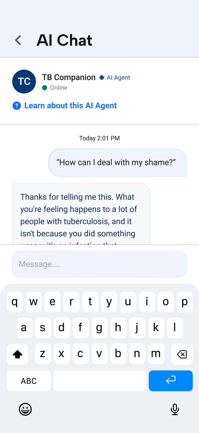
Patients ask questions inside the Companion app, rather than seeking support from an unverified source. The agent answers general TB questions immediately, offers a coping skill when an appropriate situation arises (stigma, isolation, or treatment stress), and routes anything outside its scope to the TB care team as an alert. Safety-sensitive inputs never reach open-ended generation; instead, they return a fixed response. The design target was to augment the treatment supporter. Their work shifts from typing the 4,000th reminder to reviewing what the agent has flagged.
How it was built
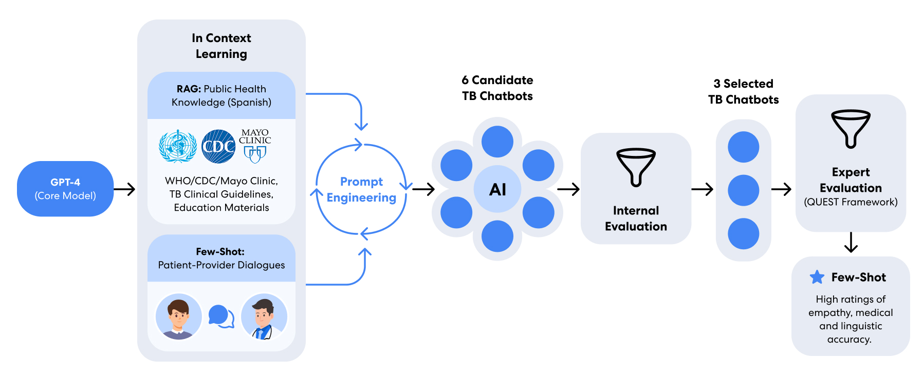
The agent runs on GPT-4. All the engineering is in the prompt; the model was never fine-tuned. The variants compare methods of in-context learning: two zero-shot baselines, one English and one Spanish; a few-shot prompt seeded with real patient–supporter dialogue from the trial; and retrieval variants layered over a Spanish-language corpus drawn from CDC, WHO, Mayo Clinic, and Southeastern National TB Center guidance. One of those combined retrieval with few-shot examples; another added a two-step classifier that reads a query as informational or emotional and routes it to a fact-grounded agent or an empathy-optimized one.
I co-wrote the prompts. I chose the few-shot examples from the exchanges the messaging analysis had already coded as carrying the most work.
Privacy
The trial dialogues that make few-shot prompting work contain identifiable patient information, so nothing goes into a prompt raw. Each word passes through a Spanish-pretrained BETO embedding model, picks up calibrated noise, and is replaced by the nearest word to the perturbed vector. A privacy budget (ε) sets how much noise. Lower ε buys a stronger guarantee and costs response quality, so we tuned it by testing.
Evaluation
Eight experts rated the few-shot agent above both retrieval variants, by up to 0.9 points.
Six prompt architectures went into internal screening. I ran that pass and cut the field to three. Eight Spanish-speaking tuberculosis clinicians then tested those three against four data-grounded personas, scoring each exchange on the QUEST framework. I wrote the evaluation scenarios and the question sets, and analyzed the returned ratings and written rationales.
Procedure
Eight Spanish-speaking tuberculosis experts tested the agents directly using four data-grounded personas and standardized measures of information quality, empathy, and therapeutic capability. Reviewers could move beyond the suggested questions, and written rationale was required for every low score and empathy rating.
Findings
Complexity did not pay off. Retrieval added nothing to the few-shot model, which experts rated up to 0.9 points higher. Retrieval alone produced the clearest failure: asked about pain relief, it returned a liver-toxicity warning that was unsafe in the context of the question. No patients and no one with low health literacy has tested the agent, which limits what any of these ratings mean.
QUEST scores
4.91/5
Safety scored highest of the QUEST items; reasoning scored lowest
Patient Safety was the top-rated QUEST item at 4.91 out of 5 across 32 ratings (eight experts, four personas each). Understanding and Reasoning was the lowest QUEST item at 4.44 and varied most between raters. Tracks Progress, scored separately, was lower still.
Recommended response
Keep the current safety-gate design; prioritize improving query understanding in the next round.
Progress tracking
3.38/5
The system doesn't track a patient's progress
Tracks Progress was the lowest-rated item across the entire evaluation, falling below 4.0 for every persona (Carla 3.50, Isabel 3.75, Sofía 3.12, Daniel 3.12).
Recommended response
Connect reporting history to the agent's context before the next evaluation round. Until it can read what the patient logged, progress tracking cannot be scored fairly.
Safety behavior
1 of 8 experts
The model's crisis alarm triggered on its own wording
The model offered “hopelessness” as one of the response options a patient could pick when describing how they felt. When a patient selected it, the model's own crisis-detection system read that same word back as a suicide-risk signal and escalated to the crisis pathway.
Recommended response
Have the model ask a clarifying question before escalating to crisis support, rather than reacting to a single word out of context.
Therapeutic alliance
1.79/2
Empathy leaned on a fixed pattern
Reviewers described responses as warm and validating, typically opening with an acknowledgment of the patient's feelings, but noted the pattern could read as general rather than personal.
Recommended response
Empathy needs to vary its shape and name specifics the patient actually said. The repeated “reflection-plus-suggestion” pattern made it read as impersonal.
Prototype
Reporting produced a record only the clinic could see. The redesign gives the patient a copy.
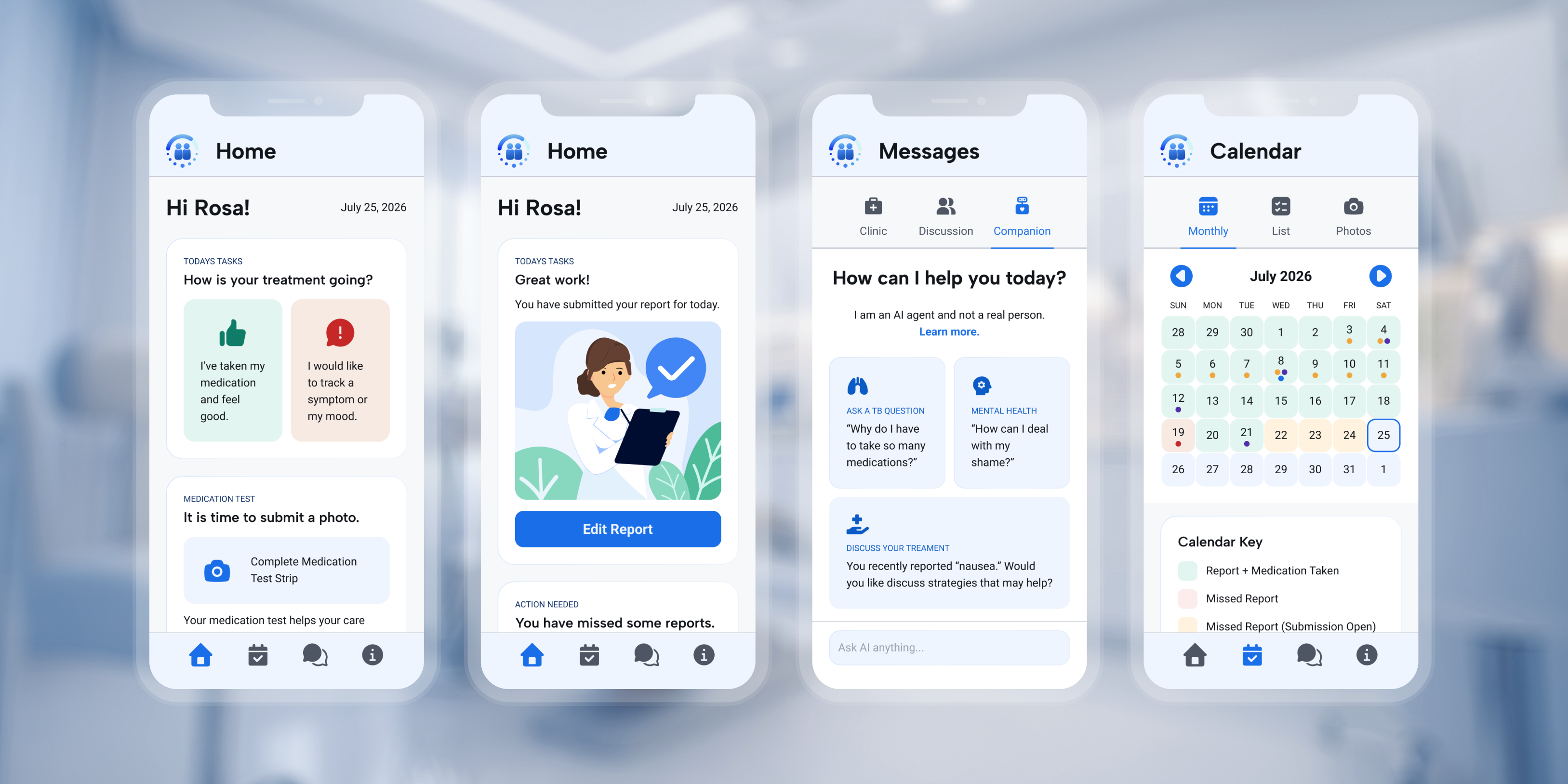
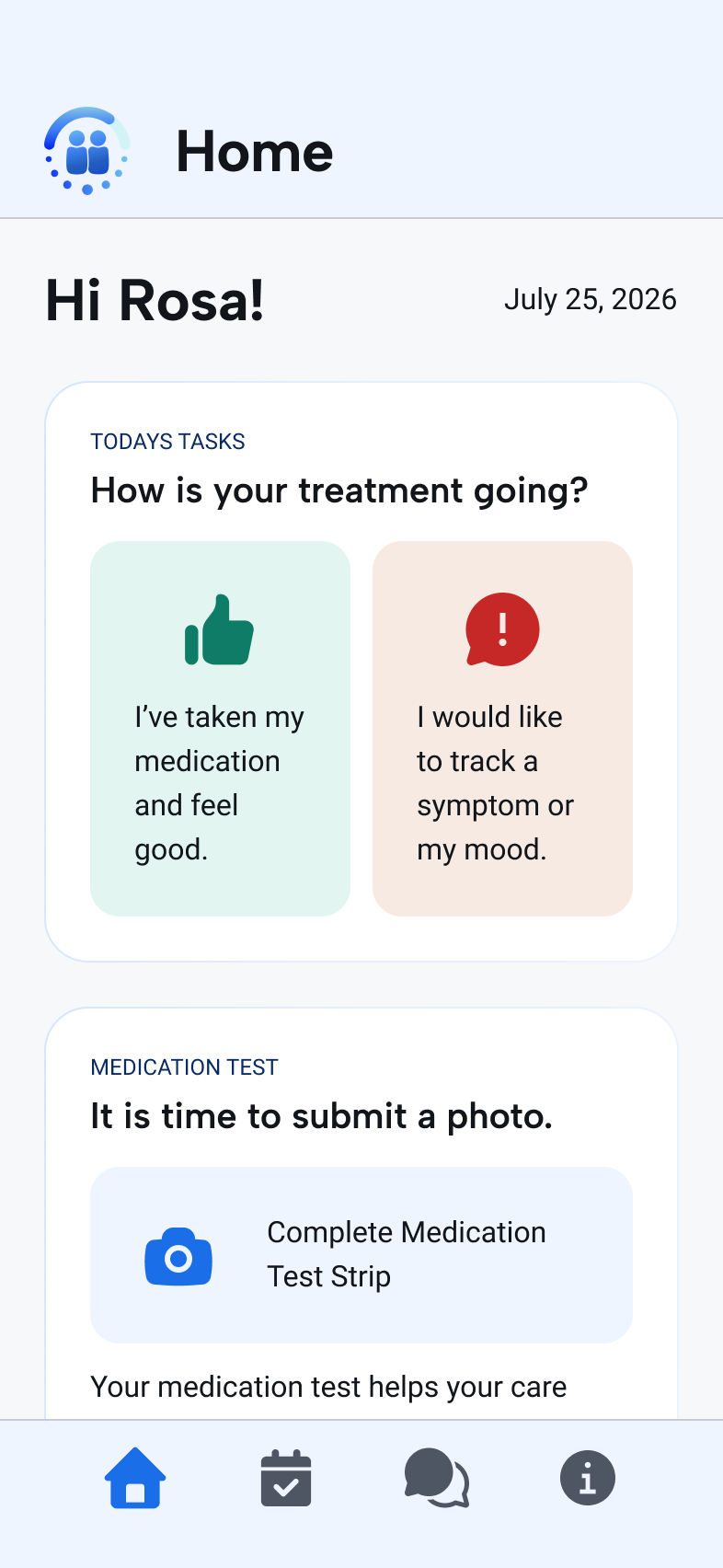
The screens below cover the full patient flow. Each one answers something the trial recorded: the reporting flow the drop-off curve, the strip test the 35% submission rate, the message tabs the two categories that carried most of the traffic.
Interactive prototype
Walk the full patient flow
The embedded prototype below connects reporting, the calendar, messages, and the AI Companion in one end-to-end patient flow. This is the build planned for the next round of testing with patients and clinicians.
Home
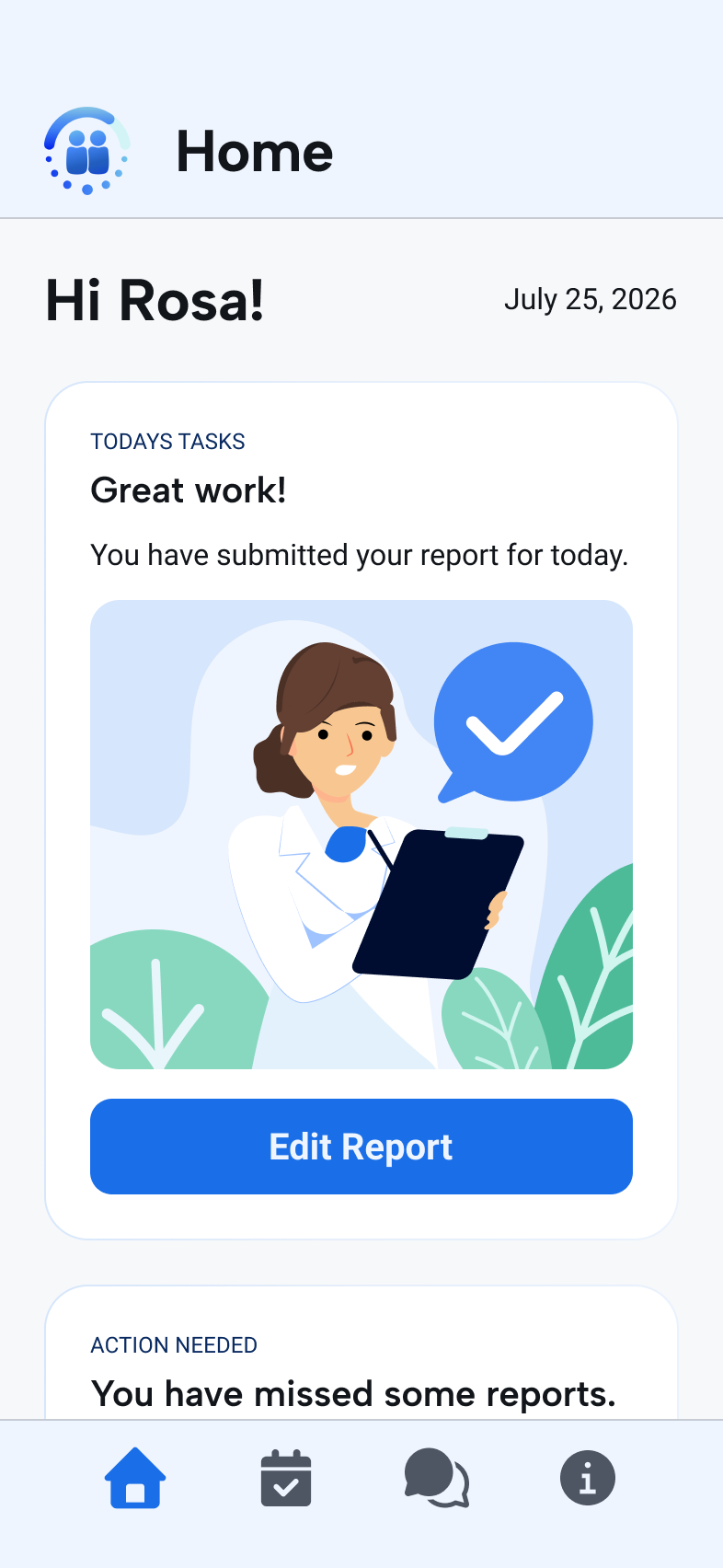
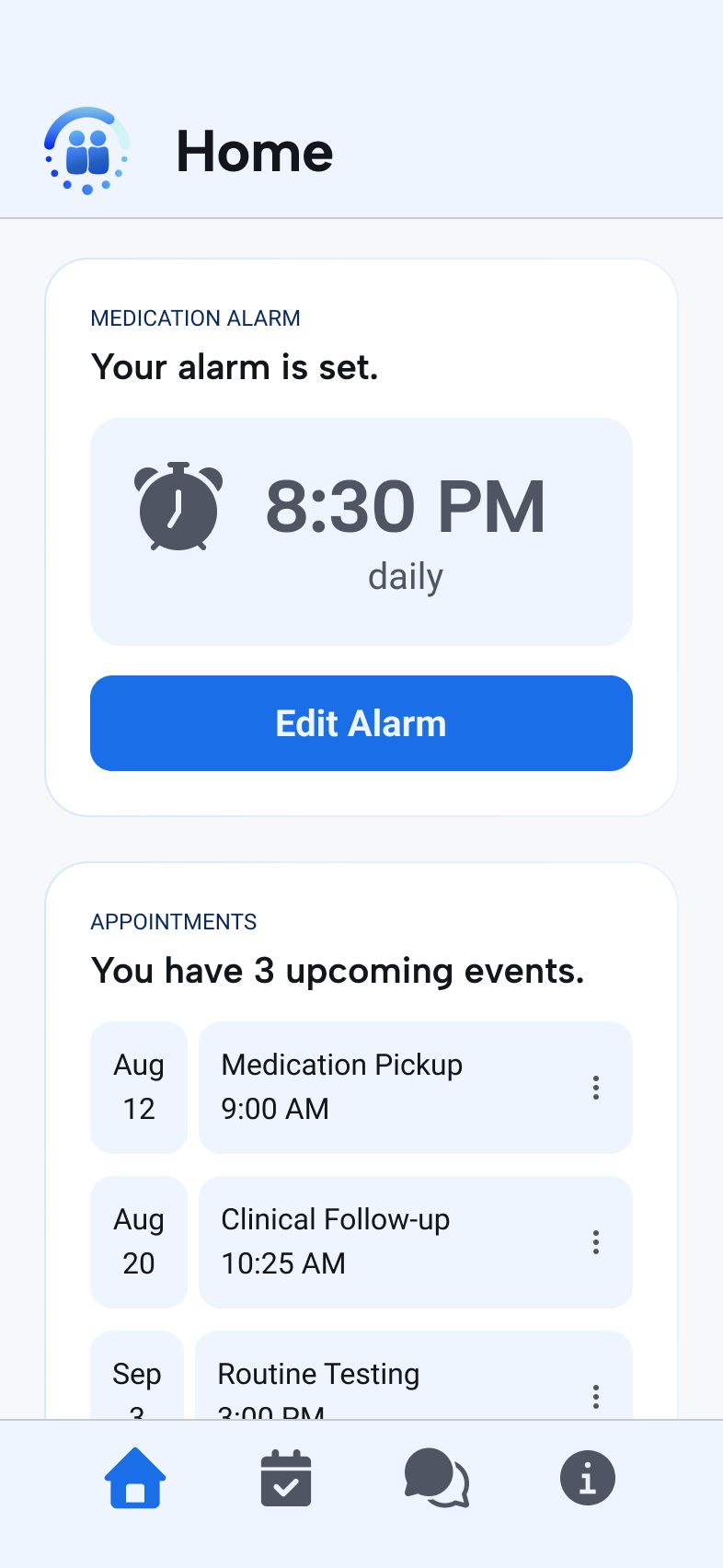
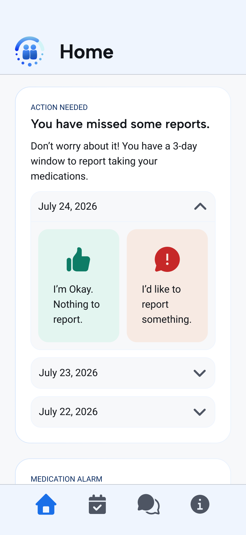
The day opens with one question, “How is your treatment going?”, answered on most days by a single tap: medication taken, feeling well. The missed-report card carries a three-day backfill window with reassurance written into the copy, so the largest category of supporter messaging becomes something the patient can resolve without waiting for a person. The strip test card now states what the test does for the care team, answering the confusion the message analysis found behind a 35% submission rate.
Reporting
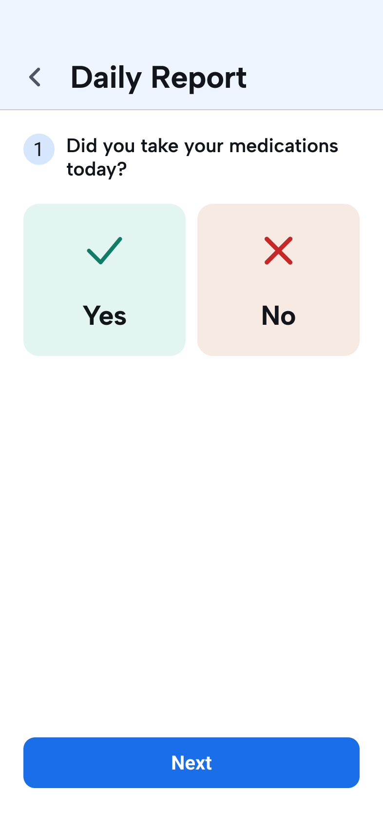
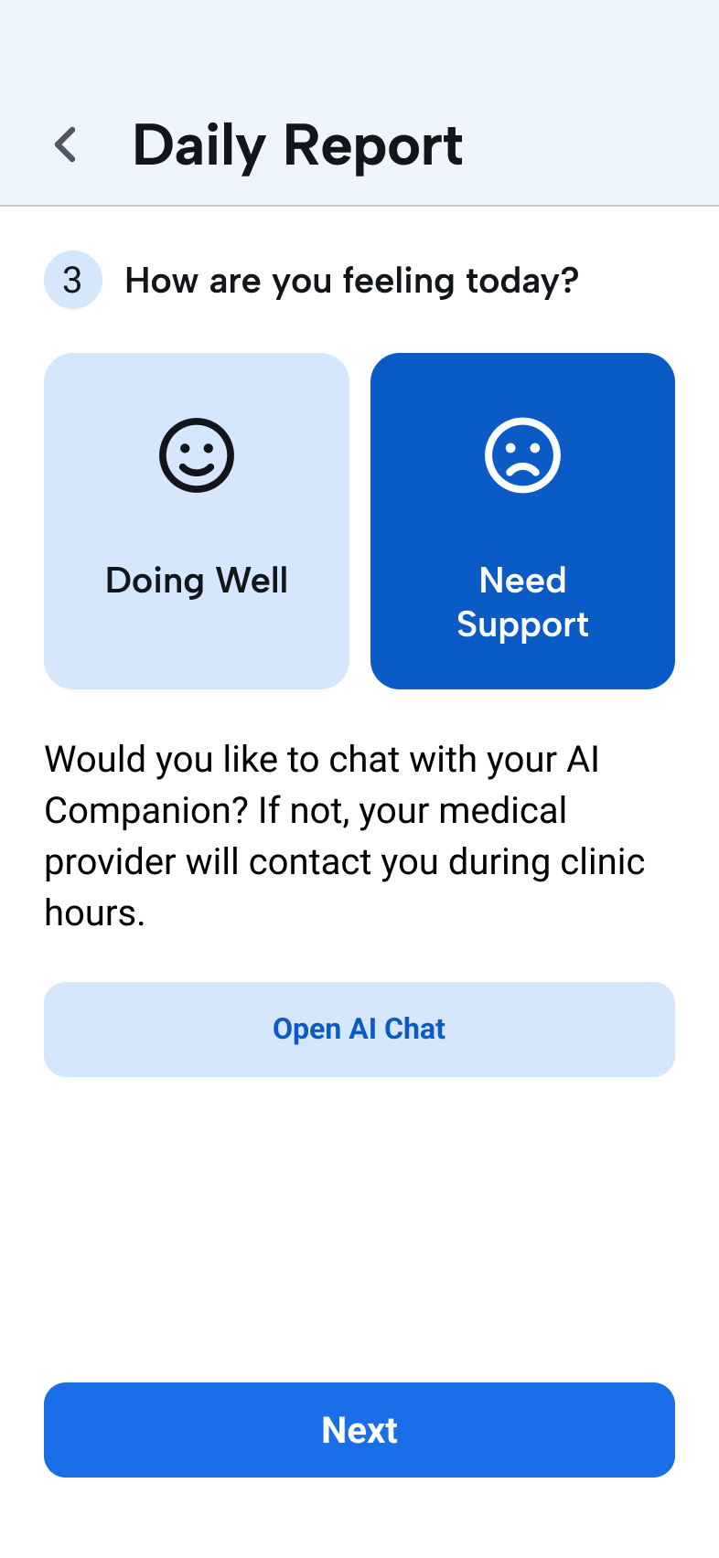
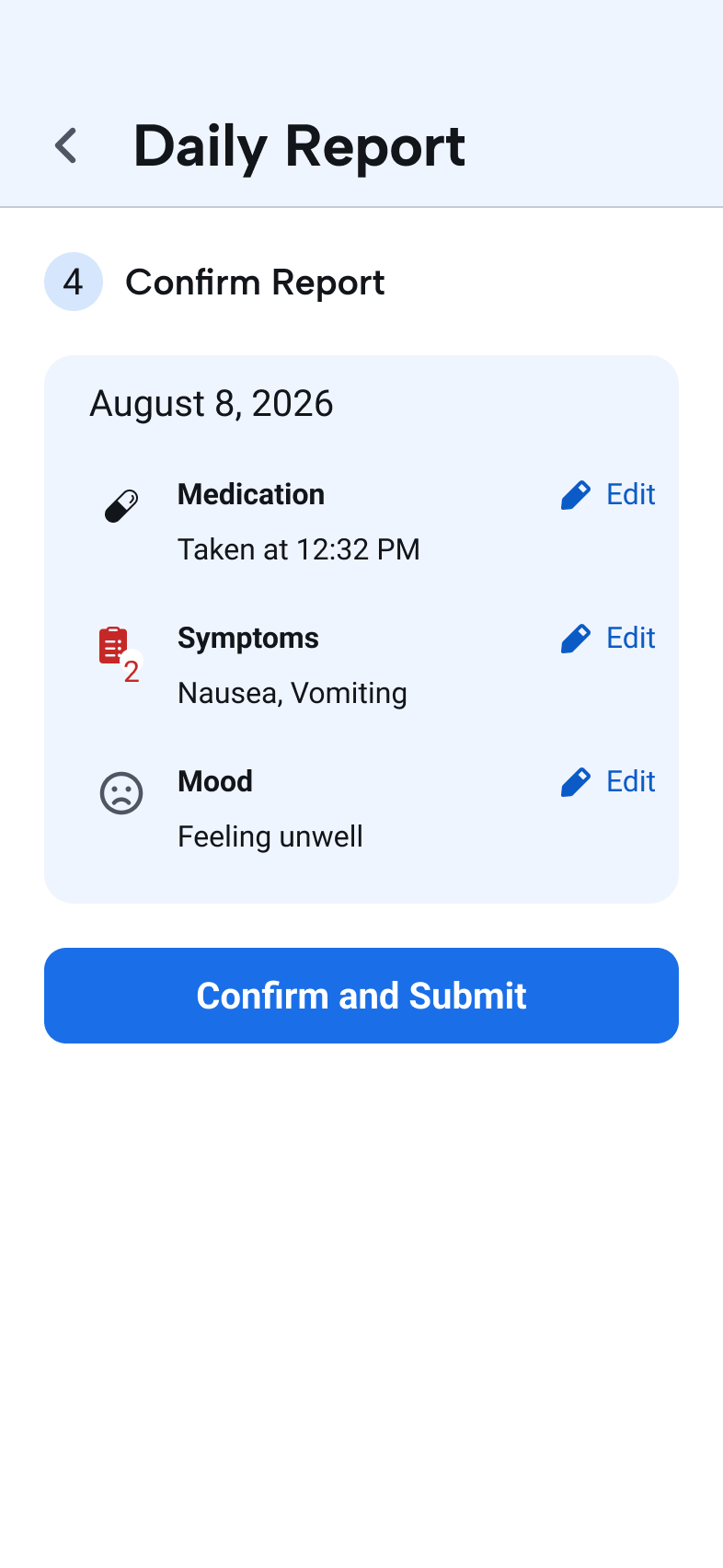
The daily report covers medication, symptoms, and mood. On a good day it is one tap from the home screen with positive states pre-filled; anything unusual opens the full flow. The third step hands the report to the AI Companion for an immediate response. Everything else reads from this record: Home shows what is still open, Calendar plots it over time, and the Companion knows what to ask about next.
Test strip photo submission
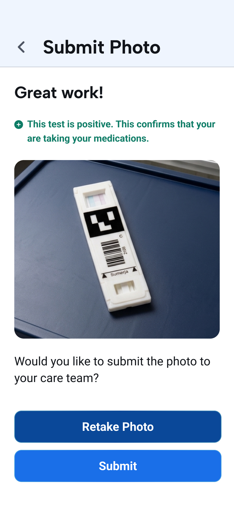
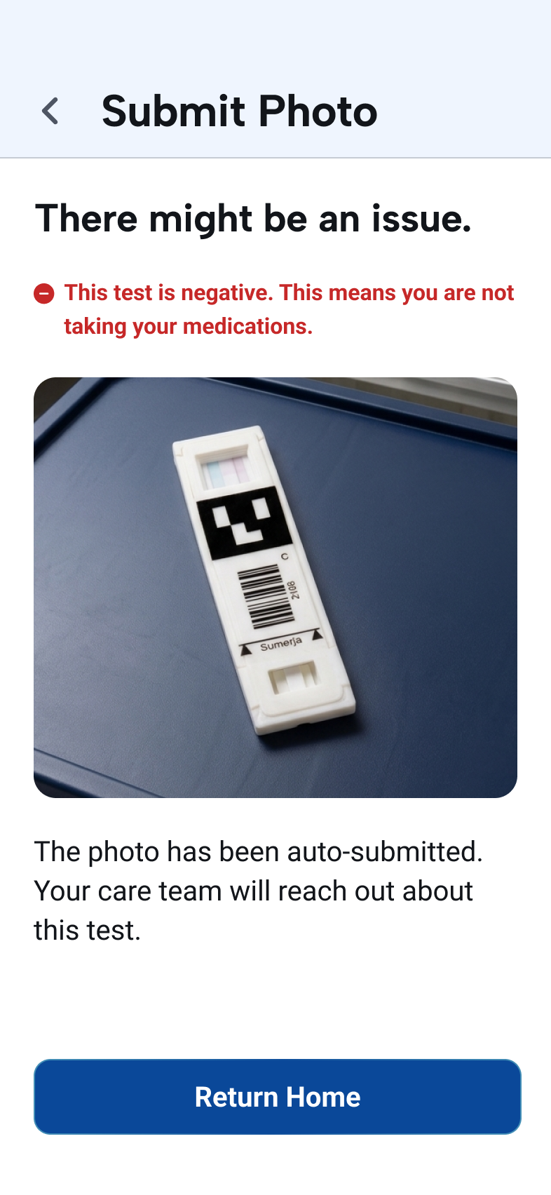
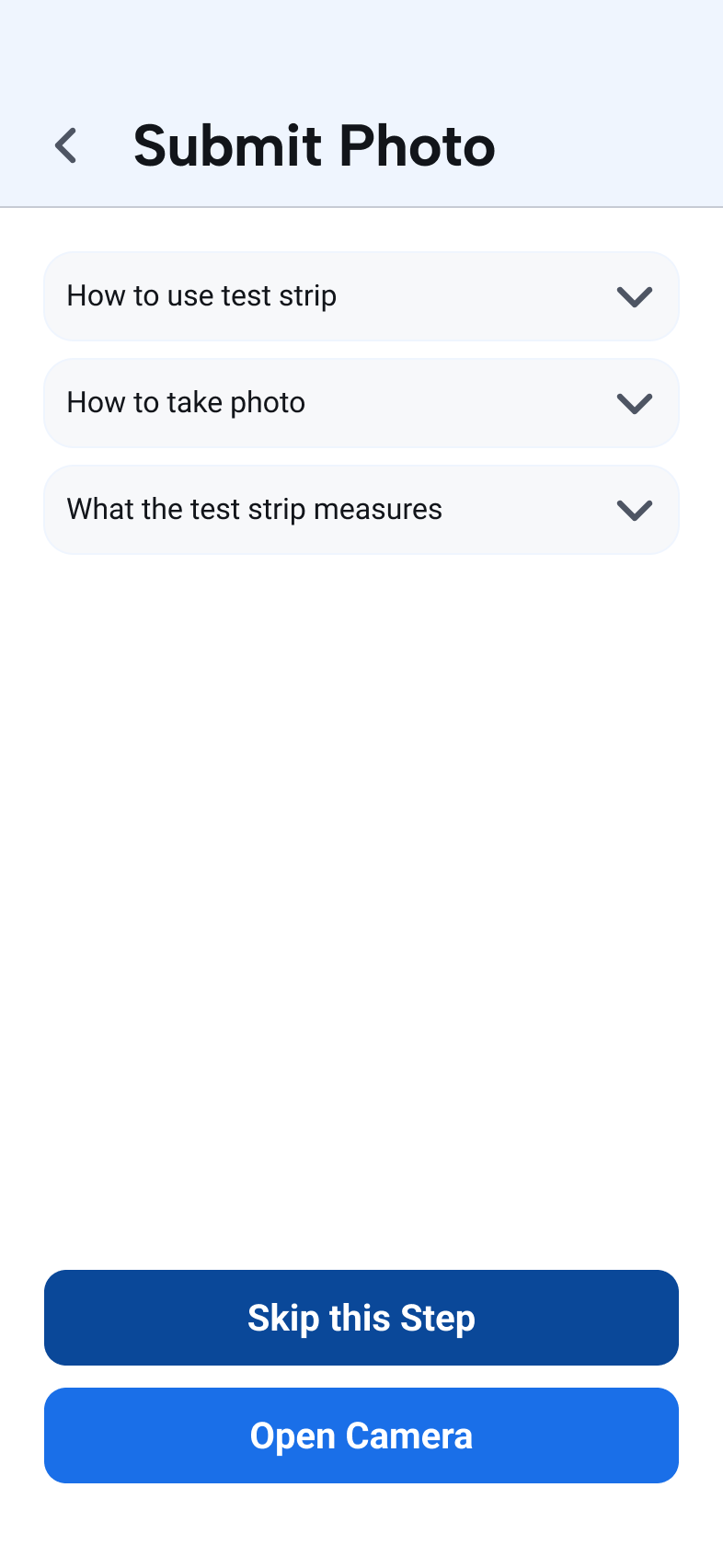
Moving the strip test out of the reporting flow separates the two actions in the patient's mental model of the app. It opens on the questions patients actually asked, two of them answered with video, because the interviews showed participants often did not know what the test measured or why a photo mattered. Photo recognition reads the strip on capture: a positive result asks the patient to confirm before it reaches the care team, a negative one submits itself and says so, and both explain the result on the spot.
Calendar
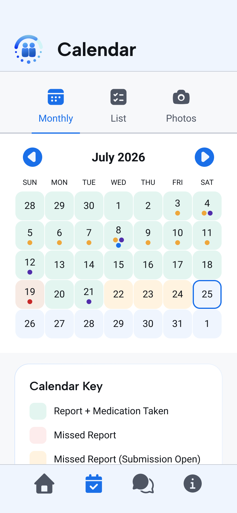
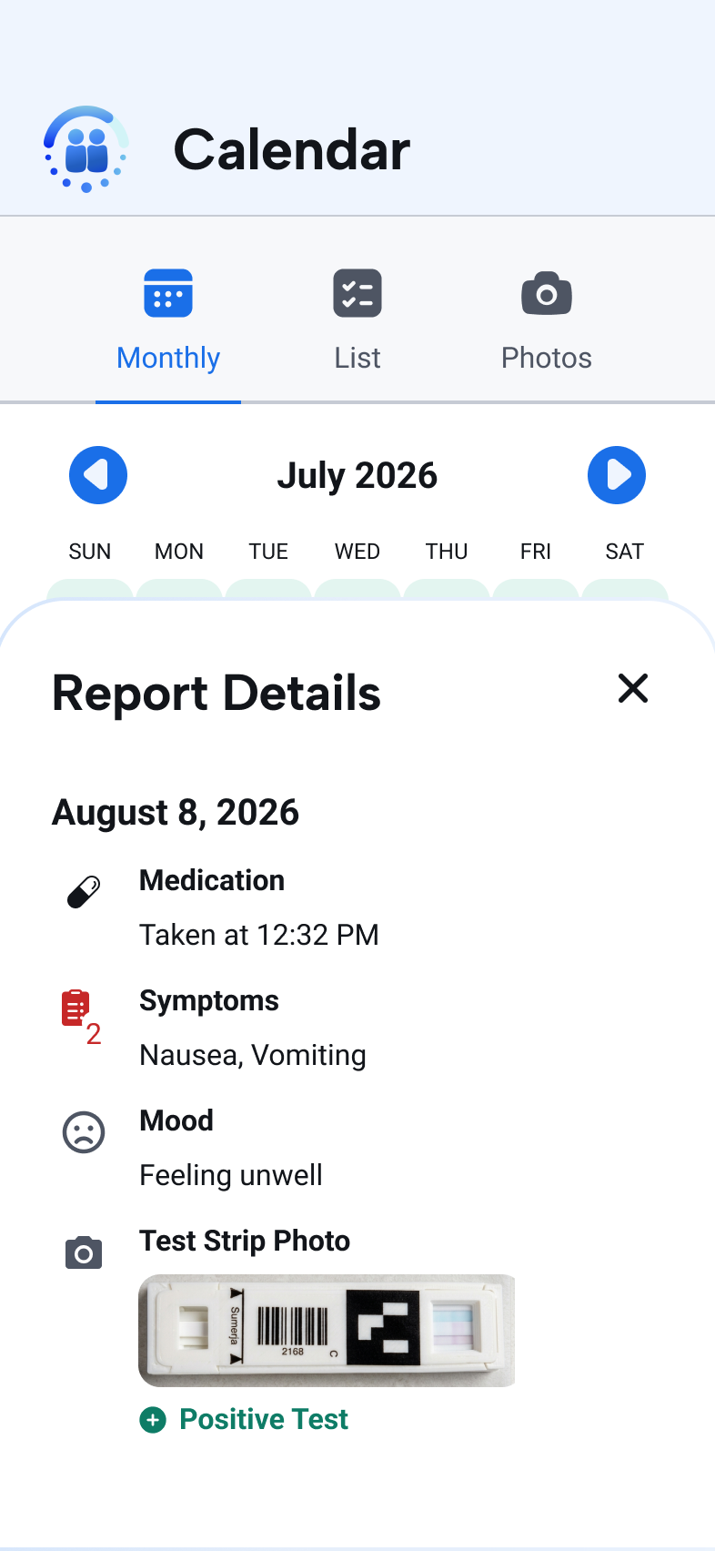
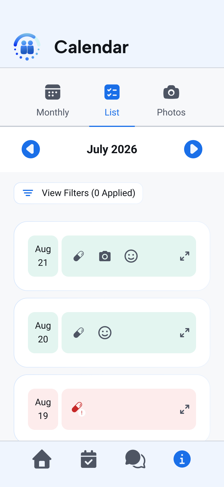
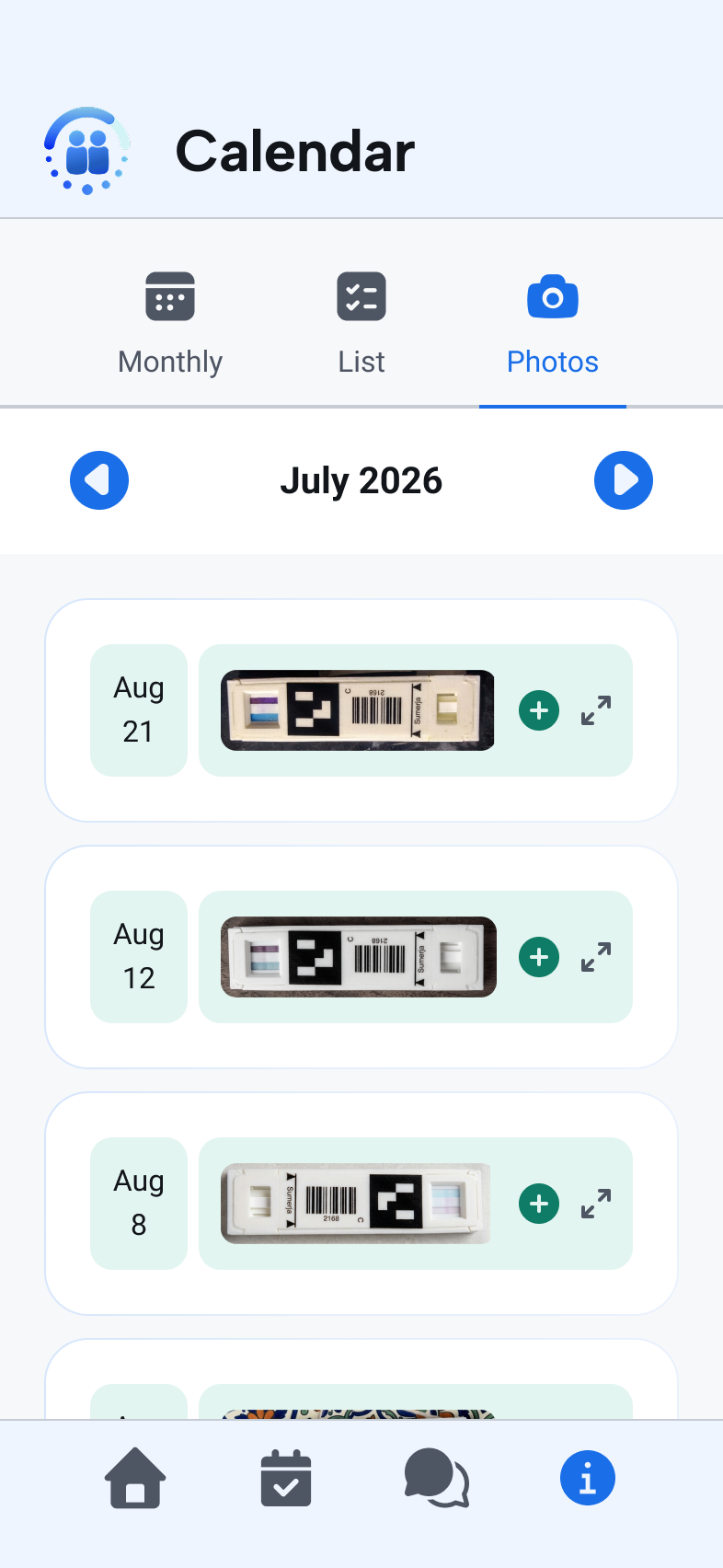
Three sub-tabs answer the same question at different resolutions. The month view color-codes reporting history so a gap reads as something to repair rather than a compliance score, and the list view exposes those days as filterable rows with medication, side-effect and photo markers. The photo view is a chronological gallery of every strip test submitted, kept for the patient's record and not only the clinic's.
Messages
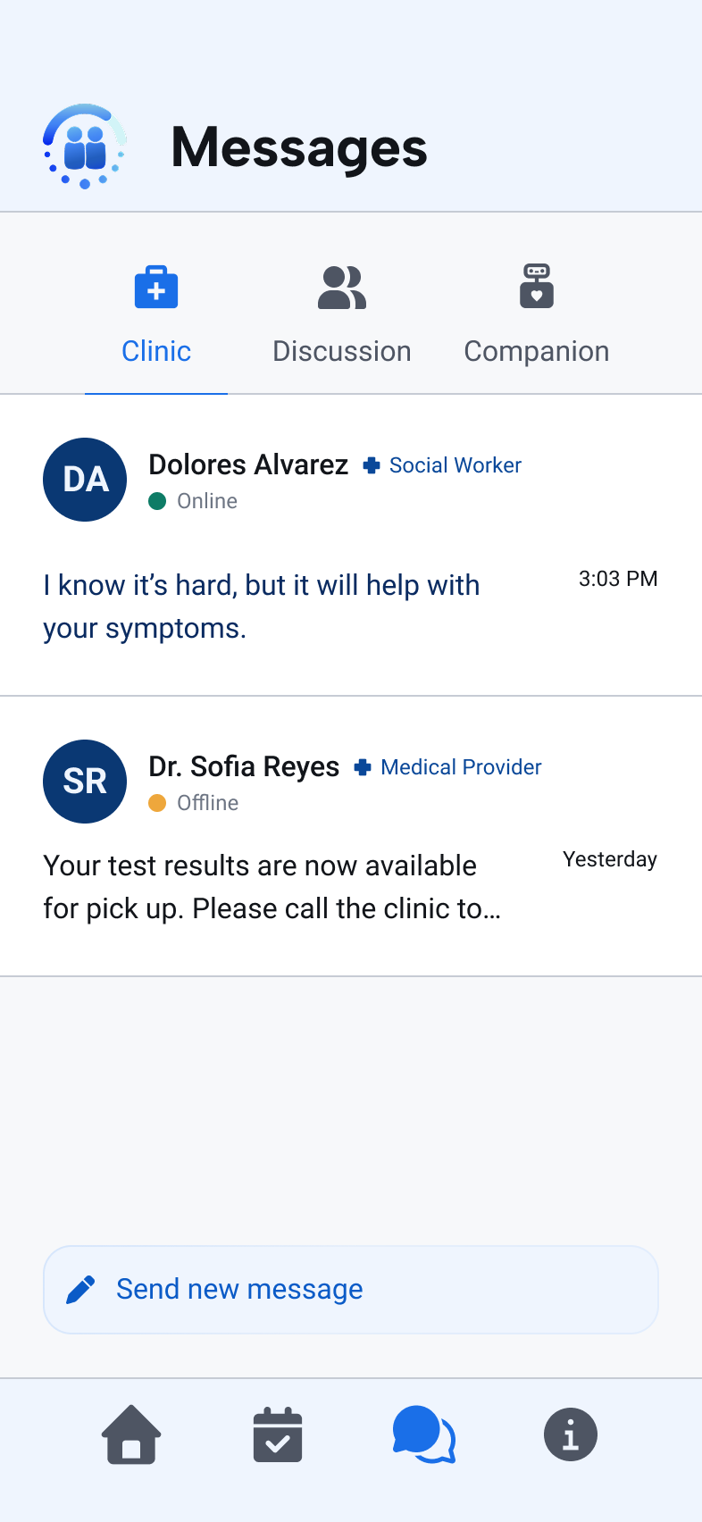
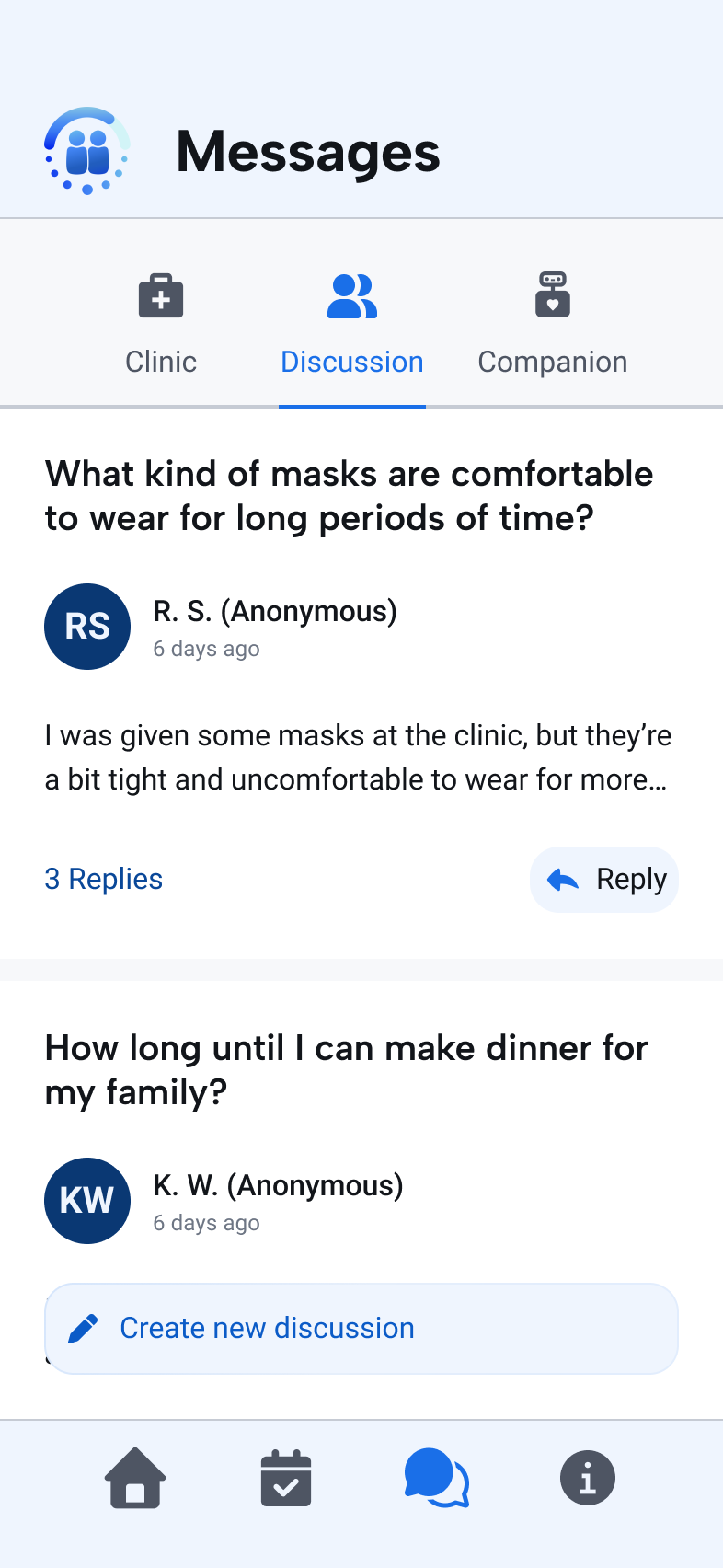
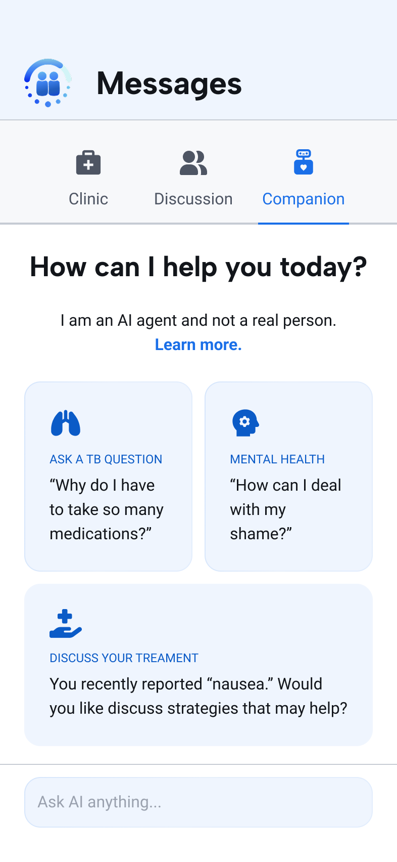
Clinic threads name the person and their role with an online indicator, so silence reads as off shift instead of ignored, and Discussion is an anonymous peer forum. The AI Companion opens on three suggested questions, one of them drawn from the patient's recent reports, with conversational and interface guardrails making clear they are talking to an agent. Escalation rules, knowledge sources, and what the agent has learned sit in the fixed header. Patients can read them; they cannot change them.
Information
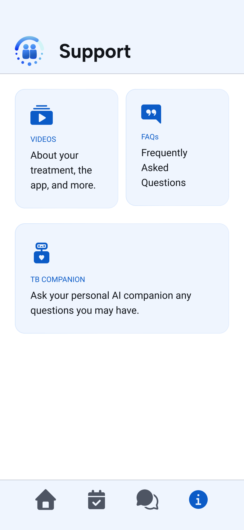
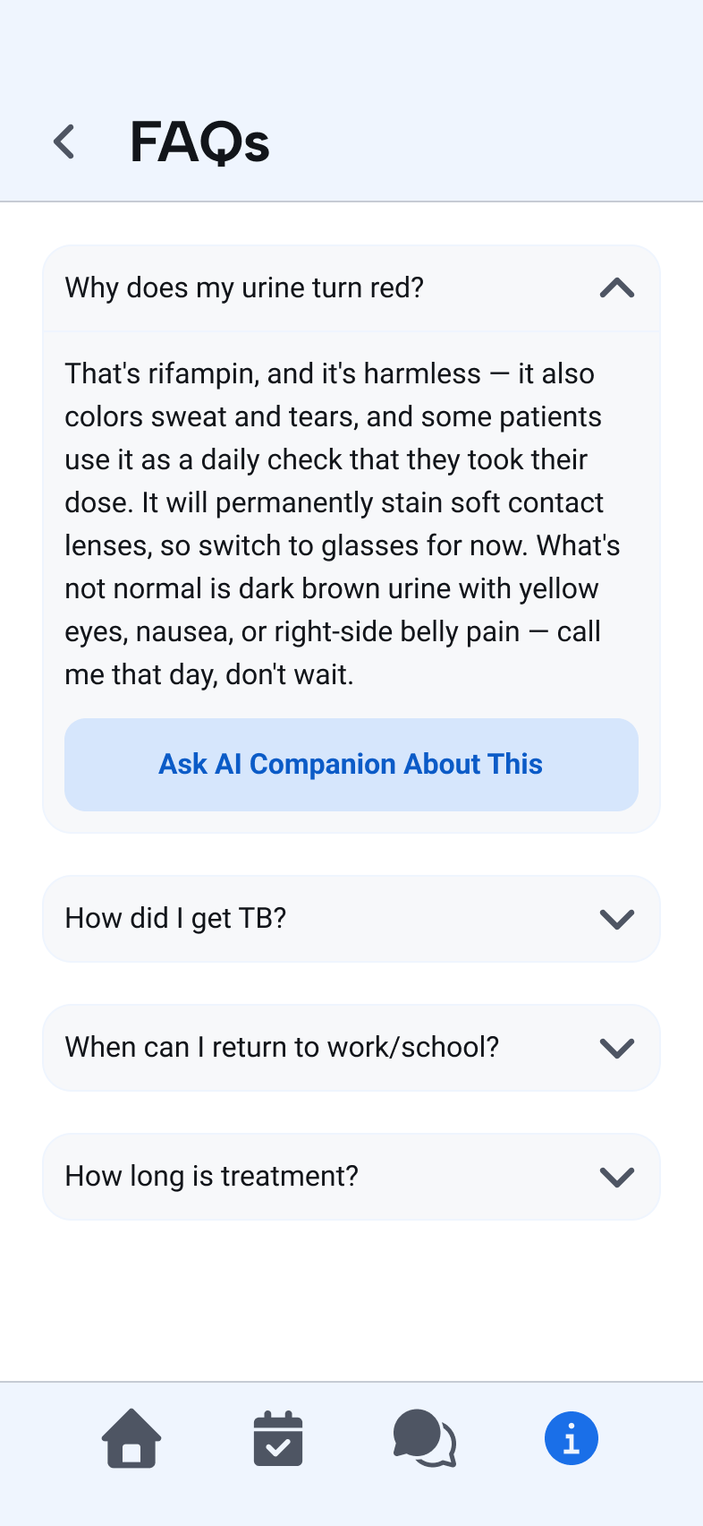
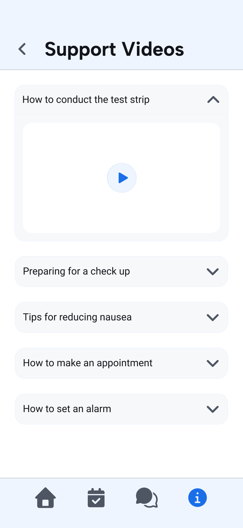
Support opens on three routes: short videos, FAQs, and a second entrance to the AI chat. The videos cover the procedural gaps where showing beats telling, like running the strip test or what to expect at a clinic visit, and the FAQ set comes from the message log, so these are the questions patients actually sent. Any FAQ can be handed to the AI Companion as an opening, for the patients who want the longer conversation.
Next Steps
The agent has never been tested inside the product it is meant to run in.
The evaluation cleared the agent for patient testing. The next study should put the integrated product in front of patients across health-literacy levels, connectivity conditions, and stages of treatment, and connect the agent to reporting history so progress tracking can be scored at all.
Reflection
The hardest part was reading a finished trial as a design brief.
Two things came out of this project: one about where to look for evidence, and one about what a panel of clinicians can and cannot tell you.
The existing evidence constrained the solution
Every design decision here traces to something the trial already recorded. The explain-first test flow came from a 35% submission rate and the interviews that explained it. The agent's scope came from the two message categories that carried most of the traffic. No new generative research was run for this redesign, and none was needed. The trial had produced a behavioral record of the whole treatment course, and nobody had read it as design input. That is the habit I took from this project: ask what a project already knows before proposing to go find out.
What the testing couldn't show
The evaluation measured the model, not the final product. Eight TB experts working from personas is a fair proxy for clinical safety and a poor one for a patient six weeks into treatment who is tired of the app. Progress tracking scored the lowest at 3.38 out of 5, and that was the one capability a hosted chat window could not test fairly: the agent had no reporting history to read. I would not present these scores as evidence that the design works for patients. They are evidence that it is safe enough to put in front of them.
Sources
The evidence behind the project
The clinical outcomes, study design, and treatment definitions referenced in this case study are documented in the published trial, its registration, and the World Health Organization reporting framework.
Continue exploring
Learn about the original TB Companion app that was deployed as part of the RCT


.png)