My contribution
Led the user-centred refinement between the pilot and the trial
I led the formative research and design refinement that turned the Companion pilot into the patient-facing app used in the trial. The study team in Argentina ran the clinical trial.
Scale
555 patients across four public hospitals
TB Companion supported patients throughout the six-month treatment course in a randomized trial across four public hospitals in Buenos Aires from November 2020 to July 2023.
User experience
Report once a day, hear back from a named person
Patients log medication and side effects in one pass, and a treatment supporter at their own hospital reads the report and replies.
Background
TB is curable. Completing six months of treatment is the hard part.
Tuberculosis is the world's deadliest infectious disease despite being curable in most cases. In Argentina, treatment for drug-susceptible TB runs six months and is largely self-administered: patients collect about a month of medication at a time, manage it at home, and return to hospital for monthly follow-up. National treatment success has sat between 44% and 66% for a decade.
This project focused on creating a digital adherence tool that would allow providers in Argentina to better treat vulnerable TB patients and improve treatment outcomes. Prior to me joining the team, a beta application had been developed but still needed significant iteration and testing.
Deliverables
Qualitative and Quantitative Research Guide,
User Research Report of Findings,
User Interface (UI) Design System,
Lo-Fi & Hi-Fi Prototypes/Wireframes
Role
Lead UX Researcher,
Lead UX Designer
Timeline
30-week design cycle
Industry
Healthcare, Digital health
Global health, Informatics
“How might we help patients complete six months of self-administered TB treatment without adding burden or exposing their diagnosis?”
Outcome
84% of patients who used the app finished treatment successfully
The intervention was evaluated in a pragmatic, two-arm randomized controlled trial across four public reference hospitals in Buenos Aires. 555 patients enrolled between November 2020 and July 2023, and 525 were included in the intention-to-treat analysis. I ran the formative research and led the design refinement behind the application; the trial itself was run by the study team in Argentina. The figures below are for patients in the intervention arm. The trial and its accompanying studies were published in The BMJ, PLOS ONE and the Journal of Medical Internet Research.
84%
Treatment success among intervention-arm patients who used the app (181/215)
2.2×
Patients who stayed engaged with the app were 2.2x more likely to finish treatment successfully (n=277)
87%
of app users would recommend it to another patient (52 surveyed, self-reported)
Research
Six months of treatment, managed alone between hospital visits
I ran the formative research for the redesign: 12 interviews, 3 focus groups and 49 survey responses. All 49 participants completed the survey (38 people with TB treatment experience, 7 providers and 4 researchers), so figures over 38 are from the patient group alone. The figures below record what participants reported about their own treatment, not measured behaviour.
Sample
38 Former TB Patients
4 TB Researchers
7 TB Providers
Methods
12 Individual Interviews
49 Survey Responses
3 Focus Groups
Tools
Microsoft 365
Google Sheets
Qualtrics XM
Tableau
Research Findings
Five findings drove the redesign. Each names a gap in the beta application and the capability it called for.
76%
of participants could not say what the daily progress report was for, or where it went after they submitted it (37/49)
96%
of participants wanted a direct line to their care team between monthly hospital visits (47/49)
98%
of participants met at least one side effect nobody had warned them about (48/49)
84%
of patients recalled forgetting at least one dose during treatment (32/38)
68%
of patients wanted visible evidence that they were making progress (26/38)
Design Planning
Defining the system before drawing a single screen
The planning artifacts below each settled a question that would otherwise have been re-argued during prototyping: how a patient moves through a report, how much information the app has to hold, and what the interface is allowed to look like. Each went through several rounds of team discussion before it was fixed.
User Flows
The Daily Report was the primary way patients sent information to their providers, so it had to capture everything a provider would normally check during an in-person visit. Mapping it as a flow first made the decision points and drop-off risks visible before any screens existed, and it is where we found that patients were being asked to make choices in an order that did not match how they thought about their own symptoms.
Information Architecture
Patients needed to know where an action lived before they went looking for it. Each tab owns one task and one kind of information, so nothing appears in two places and no choice between tabs is ambiguous. For example, "History" is the record of submitted results and holds nothing else.
Design System
The design system fixed the visual language once so there was no ambiguity during the design process. It featured a type ramp sized for small, low-end displays, a restricted color set, and an icon library carrying meaning where text would have added reading burden.
Prototyping
Designing for the days a patient misses
Every screen had to work on a borrowed phone, on an intermittent connection, for someone who had just been told they had a stigmatised disease. That set the constraints: text-light, icon-supported, offline-capable, and nothing on screen that would disclose a diagnosis to anyone glancing over. Screens were designed and prototyped in English. The shipped application was translated into Spanish for patients in Buenos Aires.
Today's task first, progress second, people third
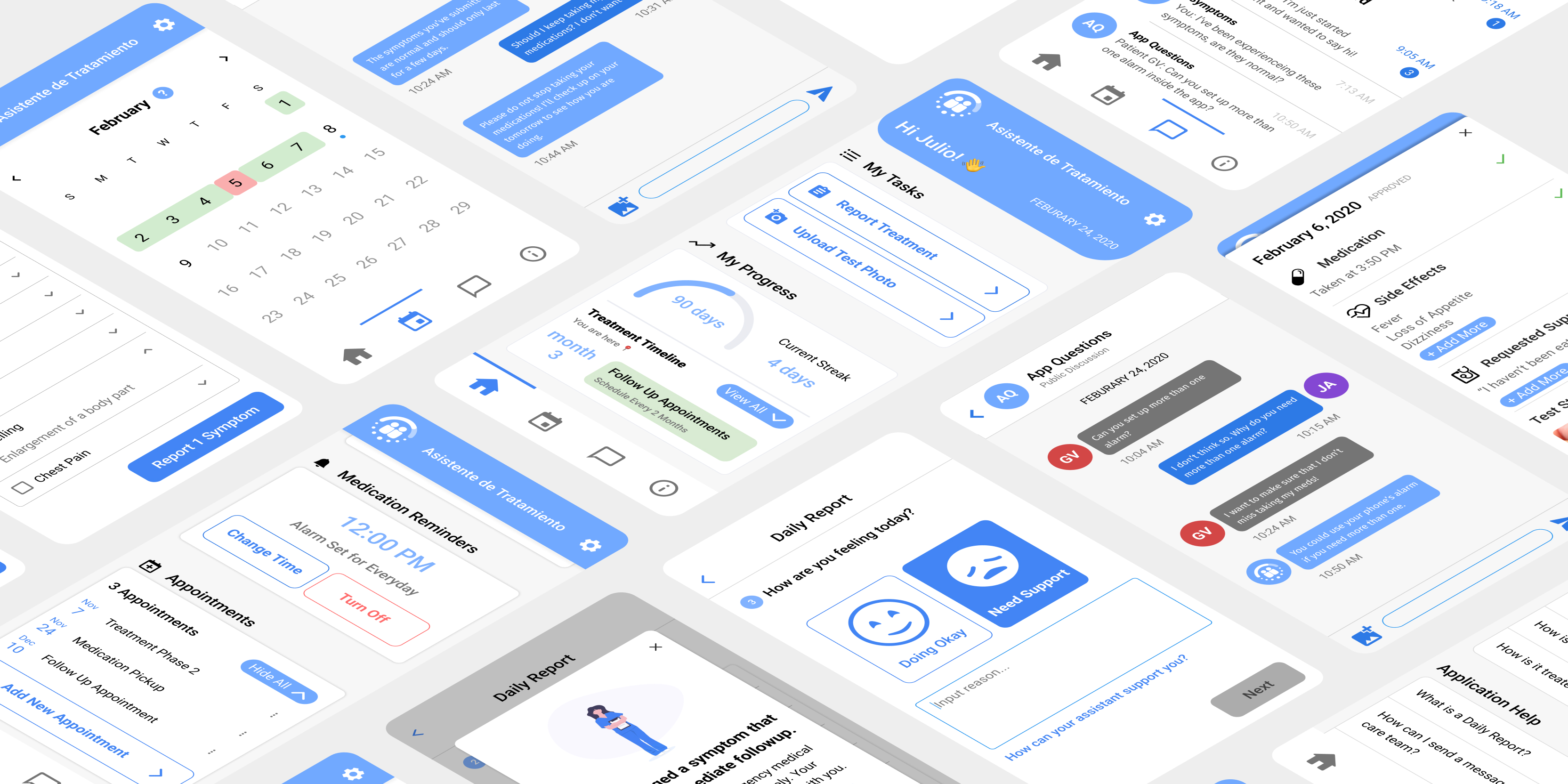
The home screen answers what a patient needs today before anything else: the report to file, how far through the course they are, and who they can talk to. Each sits on its own card with a single action attached.
The progress card came out of two findings. Patients wanted to know what to expect, which produced the treatment timeline, and wanted visible evidence of progress, which produced streaks. Medication reminders sit directly beneath, since forgetting doses was the most commonly recalled adherence failure.
One direction, one decision per screen
The daily report is how information reaches the clinical team between monthly visits: medication taken, side effects, requests for help. Participants were confused about the order of steps, so I linearised the flow and removed anything the user has to hold in memory between screens. Across the trial, participants submitted 23,103 medication reports, averaging 84.5 each over the 180-day treatment course.
The one feature that could verify rather than record
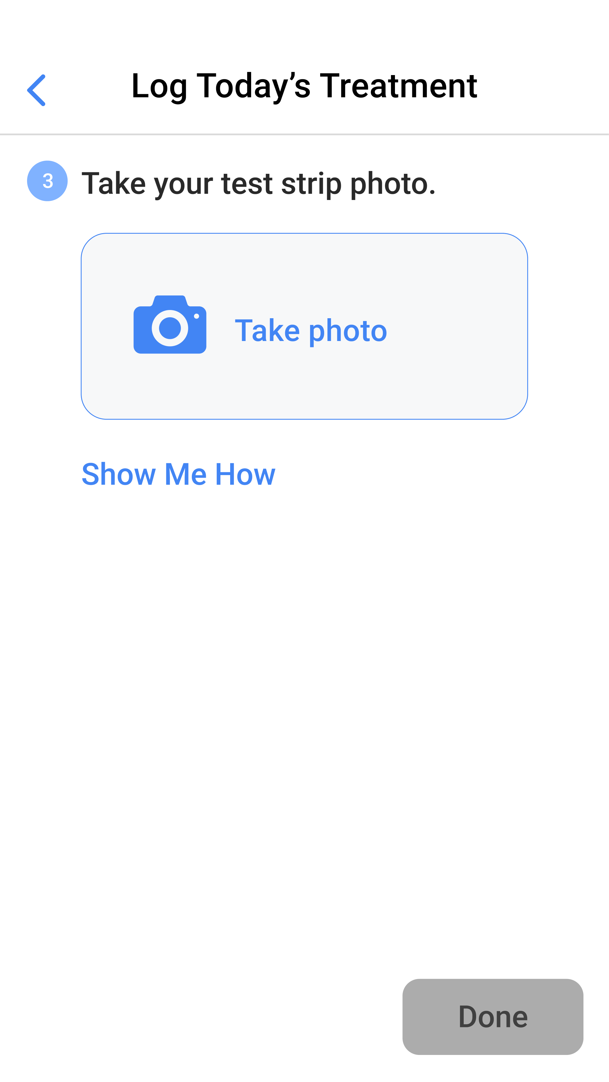
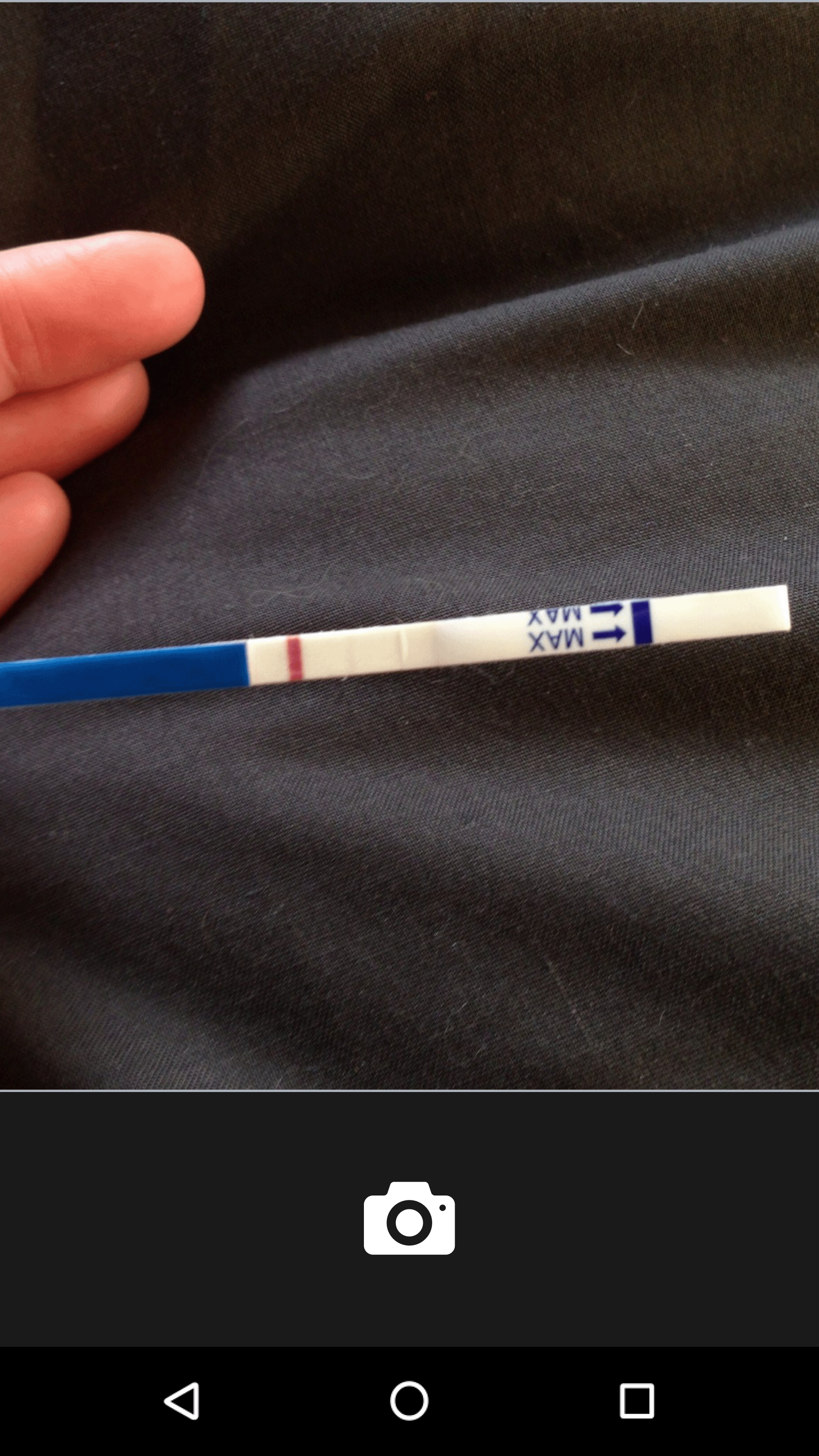
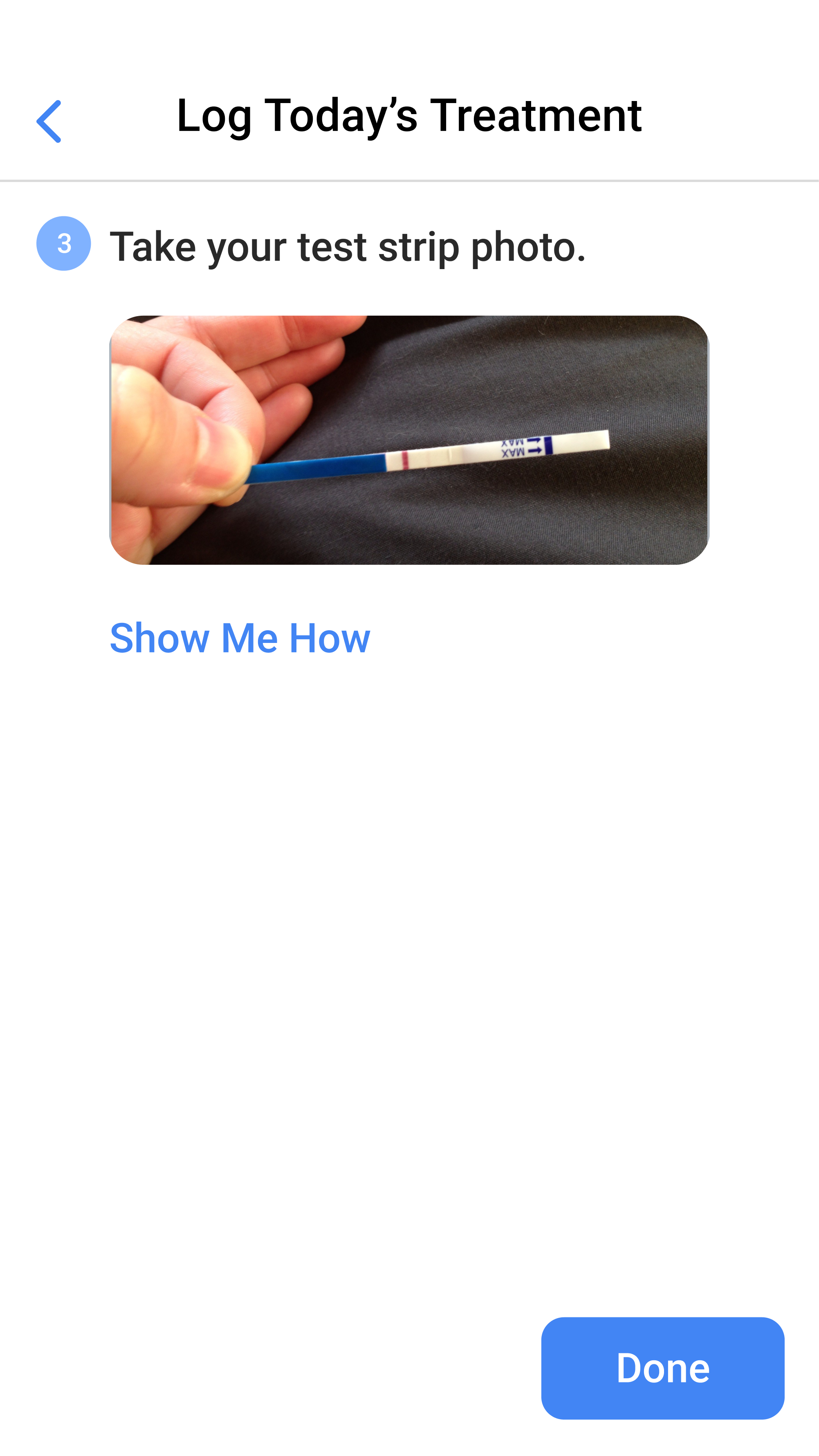
Once a week, on a random day, the app asked the patient to run a paper urine test that detects an isoniazid metabolite, photograph the strip and submit it. Every other signal in the app is a claim the patient makes about themselves. This one is evidence, and it is what separates Companion from a self-report tracker.
Rewarding consistency instead of surfacing risk
Reporting streaks were the motivational mechanism: report every day, keep the streak, see the pattern of days you struggle with. A calendar was the clearest way to hold six months of that history in one view.
Retroactive reporting for up to seven days was a hedge, so a missed day did not become a wall of failure. Stakeholders at the study sites set that window. The deeper problem only became visible in the trial data: a broken streak told the patient they had slipped, and told nobody else.
A named person at your own hospital, not a help desk
Messaging was the most-requested feature in formative research and turned out to be the most consequential one. It connects each patient to a named treatment supporter at their own hospital, a nurse, physician or social worker, who reviews their reports daily during clinic hours and replies.
We also designed anonymous peer discussion rooms so patients could hear from others further along in treatment. They did not ship, and the interview data suggests why that was the right call: peer contact was valued, but disclosure was the thing patients feared most.
Reaching patients before the symptom does
Patients kept meeting side effects nobody had warned them about, so education had to arrive ahead of symptoms rather than wait in a reference library. Content is indexed by treatment phase, sections collapse to ease navigation, and we defaulted to video over text to reduce reading burden. That last decision is the one I would reverse.
Publications
Nine peer-reviewed papers came out of this intervention
The eight listed below are the ones I co-wrote. They cover the design process, the trial, patient engagement, patient experience, and the content of messages between patients and their treatment supporters.
Reflection
The evidence arrived five years after the design shipped, and it changed my mind
Five years passed between shipping the design and reading the trial results. The three decisions I was most confident about are the ones the data argues with.
The strip test gave patients nothing back
The urine strip test was the only part of the system that could verify adherence rather than record a claim about it, and participants submitted a mean of 9.2 photos against roughly 26 expected. The interviews suggest why: I designed submission as a task that returned nothing to the patient. A model reading the strip on the device could tell the patient what the color means before the photo is sent, which turns a compliance step into something the patient gets an answer from.
Silence was the signal we missed
The calendar and the reporting streak came out of a research finding that patients wanted visible evidence of progress, and they delivered that. What they never did was tell anyone when a patient was in trouble. A patient who stopped reporting saw a broken streak; nobody on the clinical team was told. The calendar rewarded consistency when it should have surfaced risk. The fix is a missed-report threshold that raises the patient in their supporter's queue, so the signal reaches someone who can act on it.
Video cost more than it saved
We defaulted education content to video to reduce the reading burden. The same research told us patients were on borrowed phones and intermittent connections, where HD video is the most expensive thing an app can ask for. Generated text pitched at the reading level of the person asking would carry the same content at a fraction of the data cost, and could answer one specific question instead of making the patient sit through a whole topic.
Continue exploring
Explore the same app, five years on, with an AI assistant built from this trial's data.
© Alfie Aguilar Vidrio 2026. All rights reserved.


.png)
.png)
.png)
%202.png)
.png)
.png)


.png)
.png)
.png)
.png)
.png)


